1. Preparation and understanding of goals
About product
Mycelium Wallet is the first wallet on the Android platform that was originally created for the Ethereum network. Its main focus is on increased privacy and security for users with large deposits. Its task is to hide the real volume of client assets from prying eyes and provide maximum protection for the user from intruders and their own mistakes.
Identified problems and tasks
After 10 years of development, the developers found that the wallet interface, which was a pioneer in its kind, differs significantly from the interfaces of other wallets, which actively monitored each other and adopted best practices during this time. This has led to the difficulty for users to understand the product, whose interface and system of concepts they are not familiar with: established scenarios, which are similar in popular wallets, are implemented differently here, and the efficiency of such differences is questioned.
In addition, it is important to check the current interface of the wallet for consistency, as different implementation and behavior of similar components in different parts of the product have a negative impact on both the user, who cannot navigate the product due to high cognitive load and spends more time achieving goals, and the development process, as different interface structures in different parts of the product increase development and maintenance costs and slow down the development process.
It is also important to check the current interface for compliance with platform standards, namely, Google Material Design Guidelines, as they determine the principles of behavior of elements on the screen that are familiar to Android users.
Another important goal of the work is to identify UX factors that are the reasons for the decrease in the average rating of the application in reviews on Google Play.
2. Evaluation criteria preparation.
In this project, we have very limited access to metrics (explanation in the next section), so to evaluate the current state of the interface, we will use Jakob Nielsen's 10 Usability Heuristics.
- Visibility of system status: Users should have access to information about the current status and the screen should not be overloaded with excessive information.
- Match between system and the real world: The interface should use language and terminology that is understandable to users, rather than abstract terms.
- User control and freedom: Users should have the ability to undo operations, make mistakes, and return to previous steps without unnecessary restrictions.
- Consistency and standards: The interface should be consistent throughout the system and comply with design and navigation standards.
- Error prevention: The design should prevent errors and misunderstandings, rather than simply warning against them.
- Recognition rather than recall: Information and functions should be visible and accessible so that users do not have to rely on memory.
- Flexibility and efficiency of use: The interface should be convenient for both beginners and experienced users, providing them with different ways to accomplish tasks.
- Aesthetic and minimalist design: The design should be aesthetic, clean, organized, and free of unnecessary elements, which contributes to ease of use.
- Help users recognize, diagnose, and recover from errors: The system should provide information and resources for understanding and correcting errors.
- Help and documentation: If the user needs additional information, context-sensitive reference material should be easily accessible.
3. Gathering information
Source design files
There was no complete layout of the entire product. The initial interface design was developed without the involvement of a designer, and designers were later involved at different stages of development and worked in a limited area of specific features.
User Journey Map
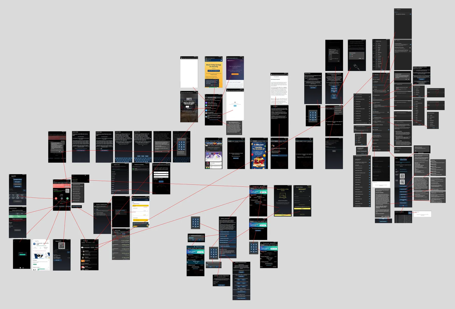
When I started, somebody has already created a User Journey Map by going through all the available application scenarios in all available states, creating screenshots, and indicating the logic with arrows or, if necessary, text.
Analytical Data
There is no access to analytics systems, as one of the product's values according to the founders was enhanced security. A potential vulnerability in the analytics system integrated into the product, and the data it transmits, pose a risk to the user's assets, as it could potentially give a malicious actor the ability to obtain users' private keys or initiate transactions.
Interviews with Developers and Founders
During the interface analysis, questions about the functions and logic of the application were collected, which were answered in batches by the project team's representatives. This allowed us to create a comprehensive impression of the product.
User Feedback
The founders prohibited collecting user feedback directly within the product's forms, because, in their opinion, this undermined the image, data from technical support, reviews on Google Play, and influencer reviews was used.
4. Defining Audit Scope
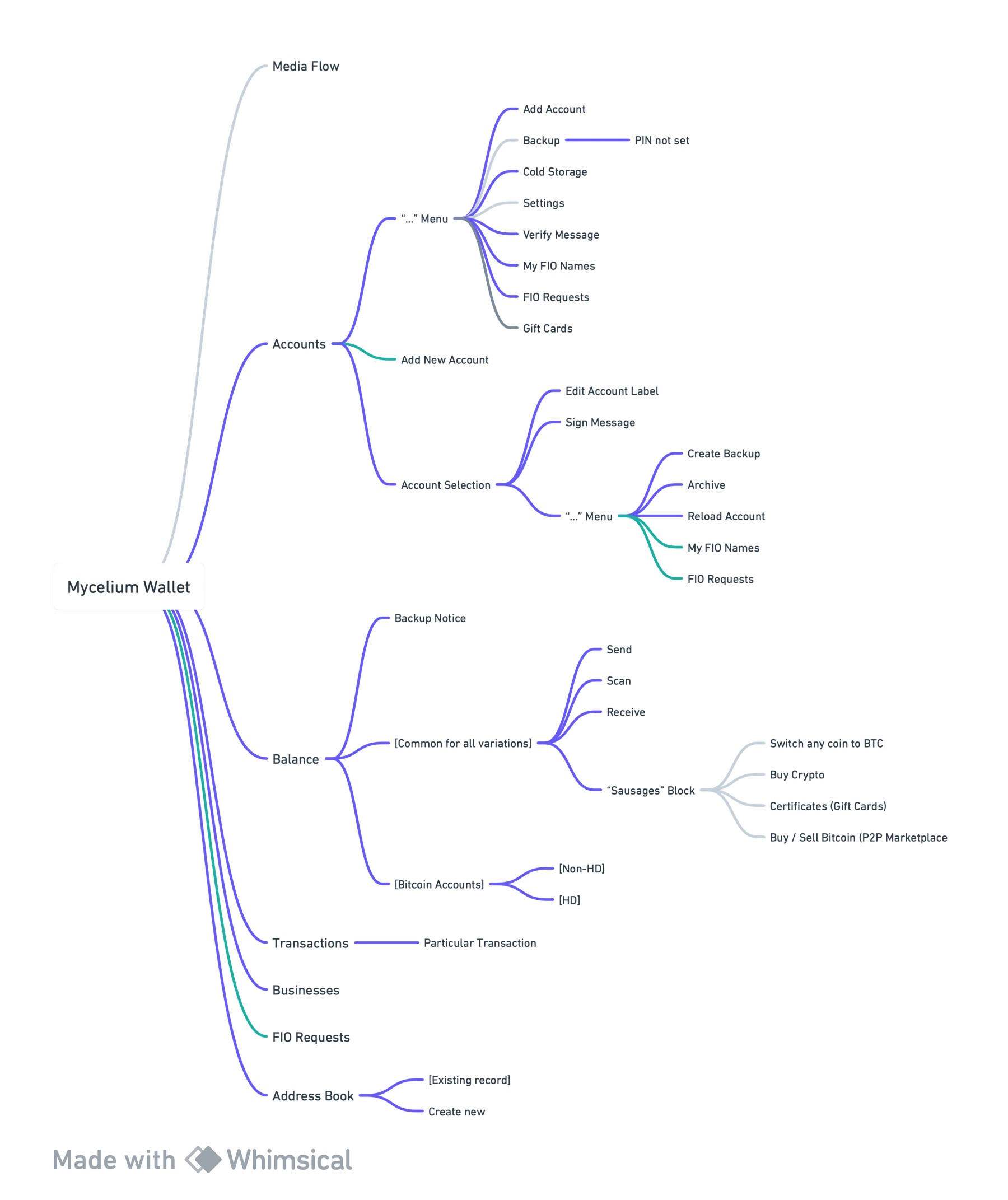
For audit convenience, all the application's functionality was presented in the form of a mindmap. Each node represents 1 unique screen. Dark blue connections show screens that are part of the research perimeter, gray connections show which screens are excluded from the study, and green ones show duplicates. In total, 36 unique screens are subject to analysis.
5. Expert Evaluation
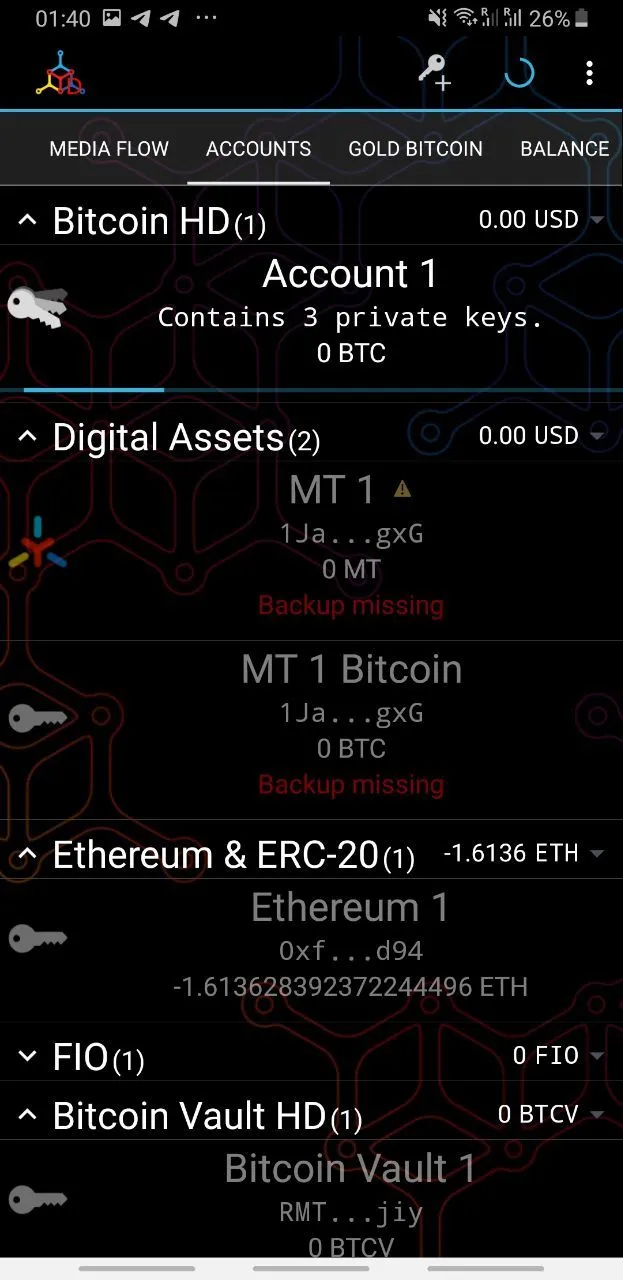
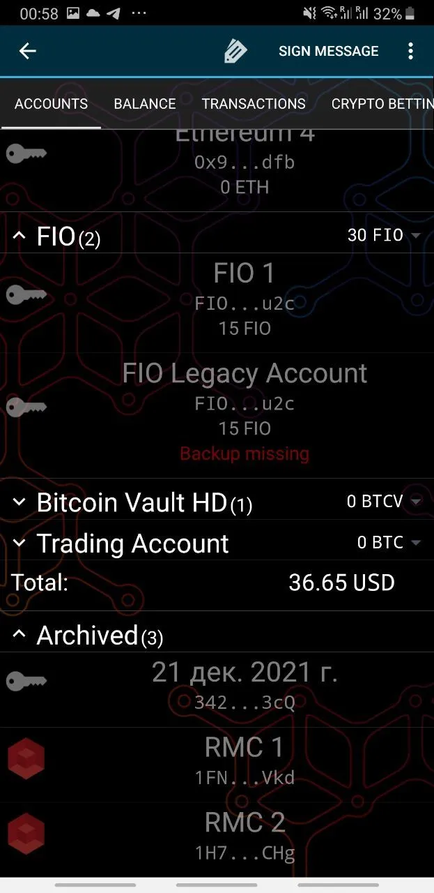
Accounts Screen
Problems
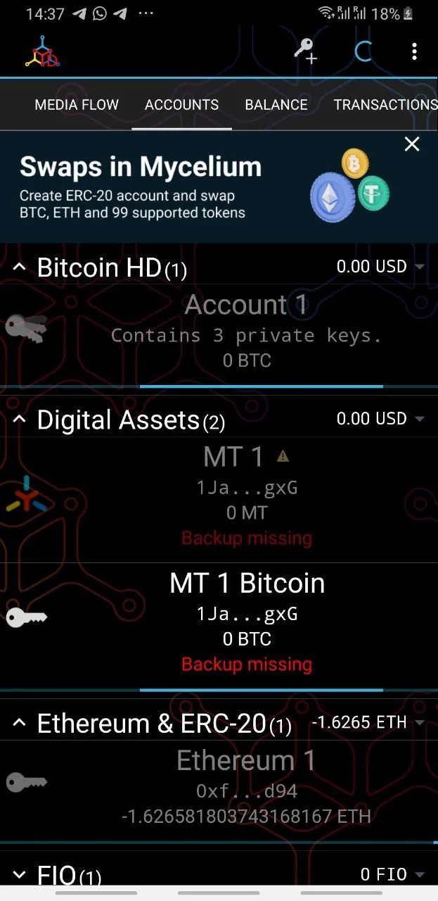
- The definition of "Bitcoin HD" The term HD stands for "Hierarchical Deterministic account," which is not clear to the average user. In the wallet context, this means that the account sequentially creates and switches to different wallet addresses to one seed phrase after each receipt of funds, and then allows them to be sent from several wallets at once to confuse blockchain analysts.
- The definition of "Contains 3 private keys" is not clear to the average user.
- The same font size is used for category and wallet headers, which violates visual hierarchy.
- The key icon is too close to the edge and, if we draw a guide line from top to bottom along the left edge of each element, this icon will intersect it, creating visual tension.
- The composition of the component denoting one account (wallet) is unbalanced, creates visual tension and therefore looks untidy.
- The image in the background is superfluous and polluting.
- Archived wallets at the bottom distract attention from the Total column and are generally unnecessary on this screen.
- Adding a new token in the Ethereum network is difficult: you have to go to the account addition menu.
Recommendations
- Replace the term HD with one more associated with invisibility and elusiveness, for example "Stealth mode" or "Ninja mode," and explain the function's essence in the welcome tour of the application and on the screen of its activation.
- Replace the definition "Contains 3 private keys" with "Has 3 addresses", since in the user's world there are addresses, and private keys are hidden inside the application.
- Use different text styles for category and account headers.
- The icon corresponding to each wallet needs to be moved away from the fields at a safe distance and aligned with the vertical guide.
- Form the wallet element based on the List element in Material Design. Align the text to the left edge. Place the icon in a familiar circular or square background element.
- Remove the image in the background.
- Move Archived wallets to the menu under “…”.
- In the Ethereum section after the coin list, add a button for adding/hiding tokens.
Click on triangle to show evaluation of all application screens
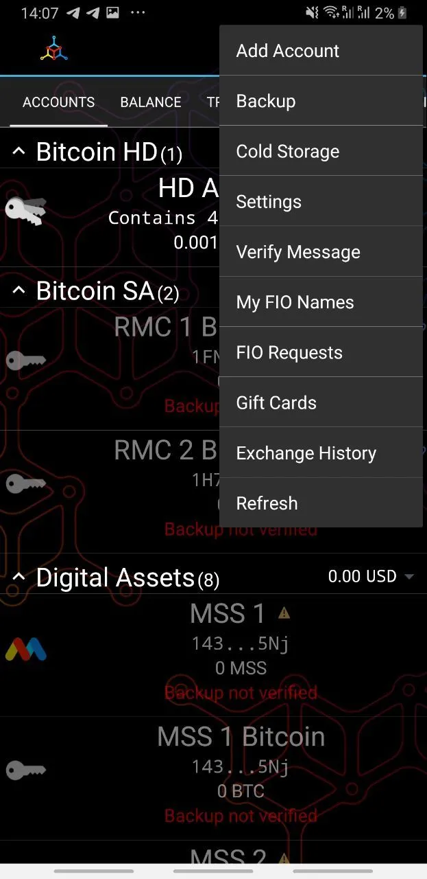
Menu under "…" in the Accounts section.
Problems
- The Add New Account function is duplicated with the one next to the menu call button.
- Cold Storage and Verify Message should be used less often than Gift Cards (conversion action), but they are located above Gift Cards in the menu.
- The menu contains too many items.
- Sign Message and Verify Message functions are logically close and relate to wallet actions, where actions such as Send and Receive also belong, but are located in different parts of the application.
- In most applications, Settings are the last item in the context menu. Users will find this more familiar.
- The Refresh button is redundant.
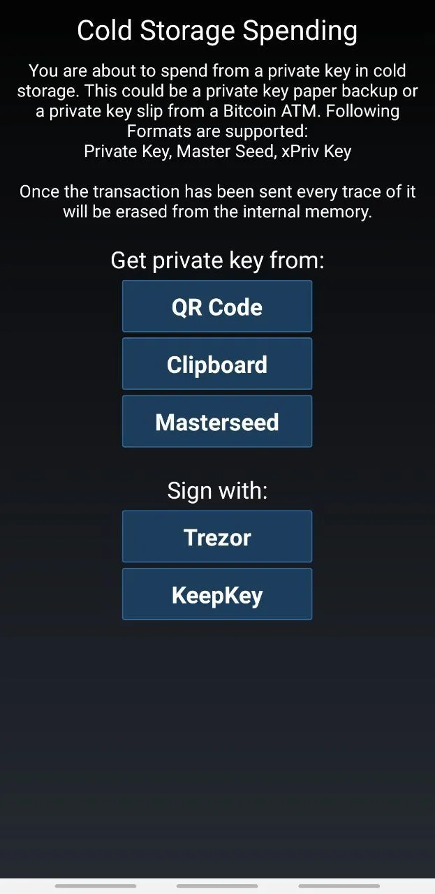
- The Cold Storage button leads to a screen where you can only spend from paper or hardware wallets, without adding them to the Accounts screen. The name misleads about a more extensive functionality.
Recommendations
- Remove the duplicated account addition function.
- Place Cold Storage and Verify Message below the conversion Gift Cards.
- Conduct an analysis and move functions to other places. Forming a separate screen hub for launching micro-applications, such as transfers via FIO, gift card marketplace, and backup manager would be a good solution.
- Place Sign Message and Verify Message
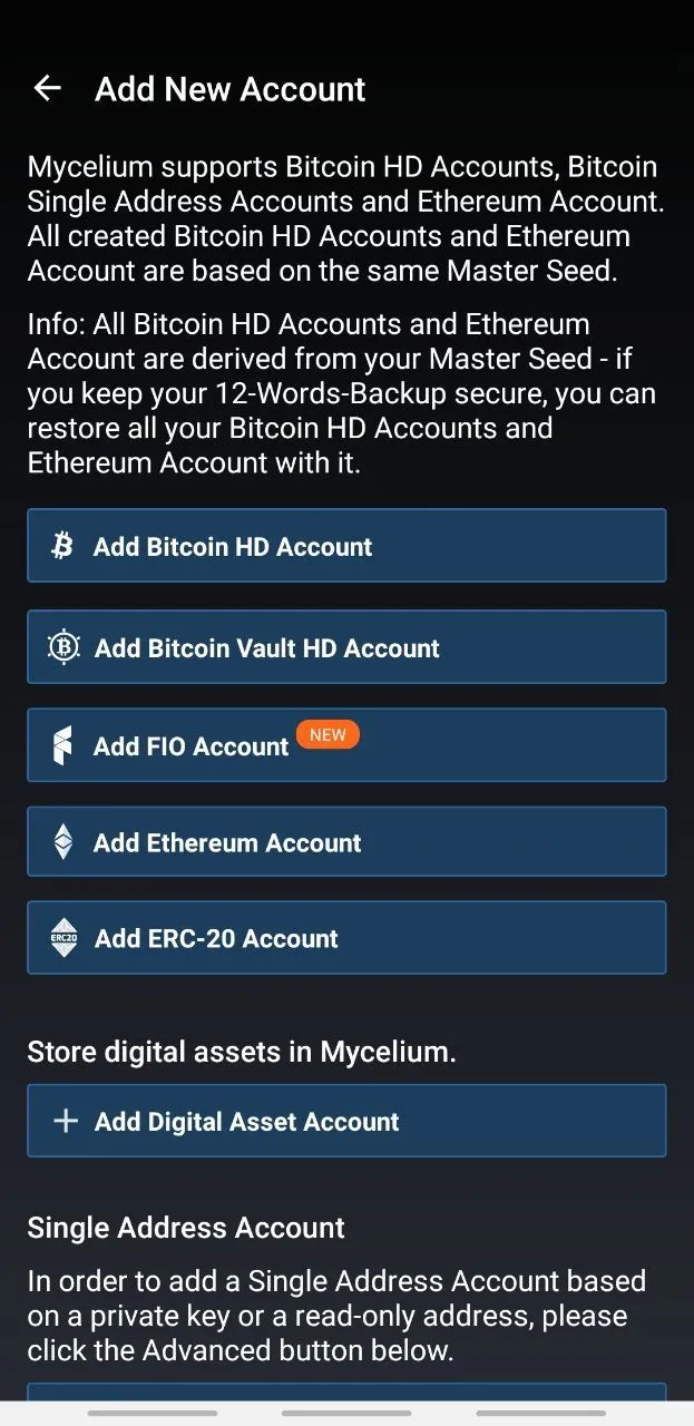
Add Account Screen
Issues
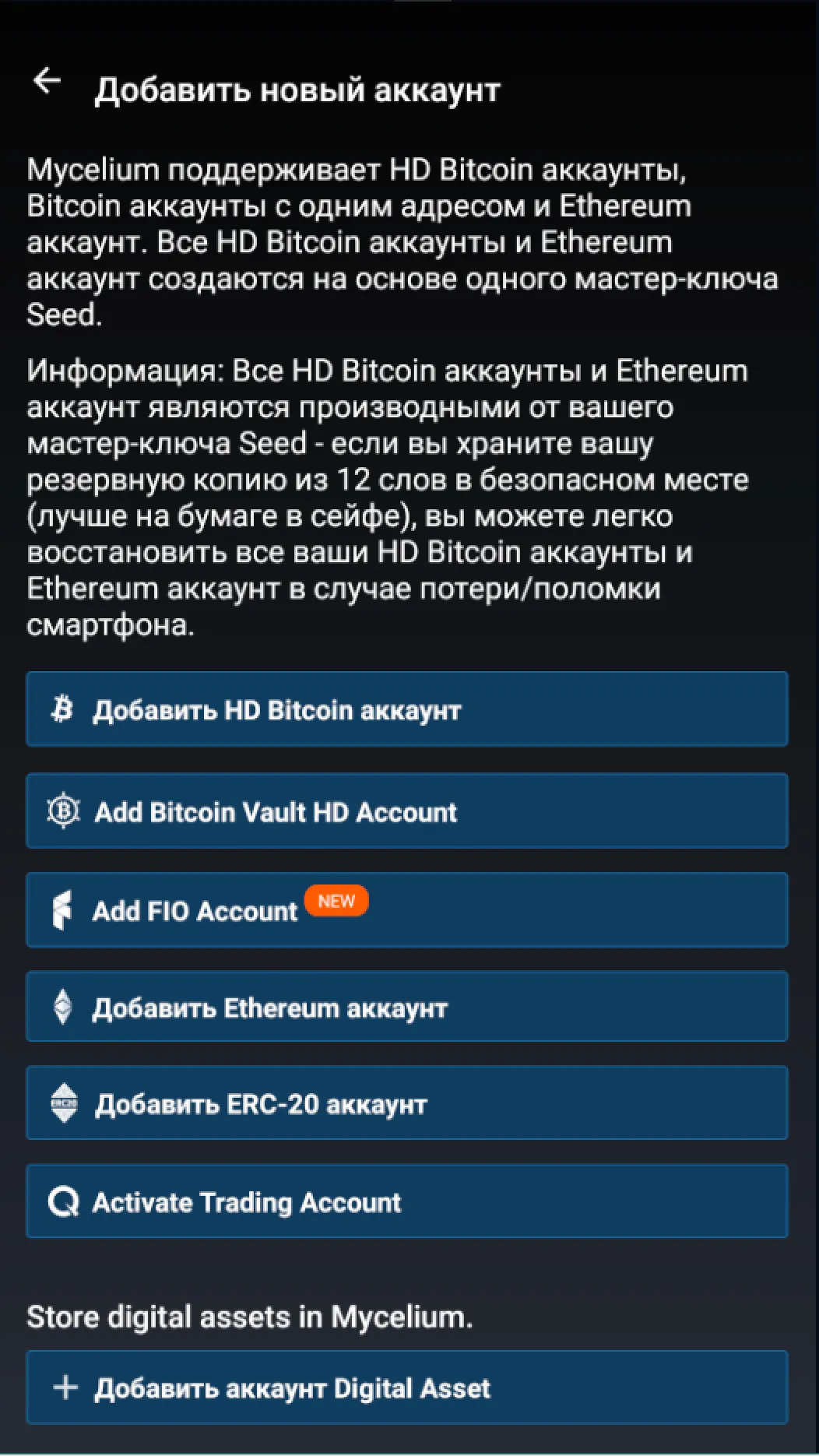
- Too much introductory text. The first paragraph simply lists the supported accounts, which are already on the page.
- Ethereum and ERC-20 seem like different networks. In fact, the "Add ERC-20 account" button initiates the process of adding tokens to the Ethereum account (ERC-20 - Ethereum token standard).
- When entering this screen, it is not clear that the hardware wallet connection is located in the Single Address Account / Advanced & More section.
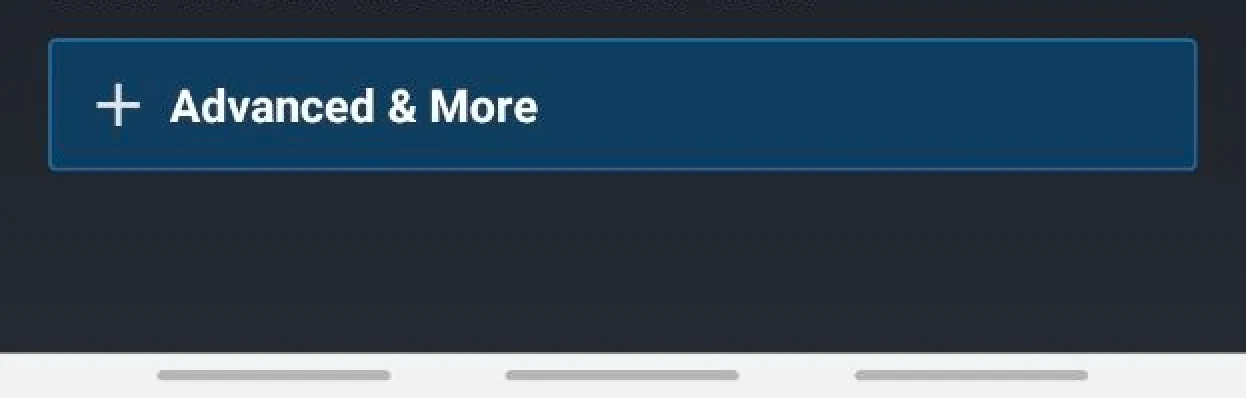
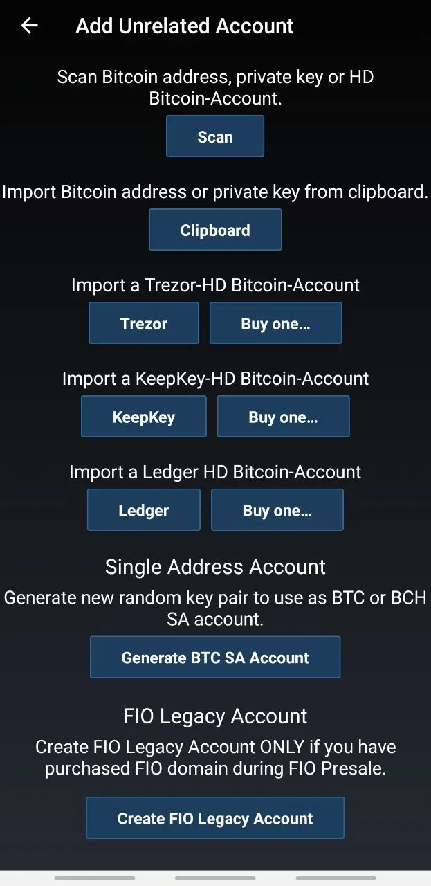
- The "Advanced & More" button, which is under the "Single Address Account" heading, leads to the "Add Unrelated Account" section.
- In the “Add Unrelated Account” section, you can add a Bitcoin account by scanning and copying from the clipboard. The buttons are arranged in a column and have different introductory texts, which take up a lot of space.
- The design of the main and nested screens are inconsistent with each other.
Recommendations
- Remove the first paragraph, rewrite the second more succinctly and without the “Info: ” signature.
- Rename "Add ERC-20 account" to "Add ERC-20 Tokens", highlight them together with the "Add Ethereum Account" button in one category.
- Show hardware wallet connection as a separate sub-item in the main menu, which would lead to a dialog with the wallet model selection with the ability to go to the site for purchase with a referral link.
- Remove the Add Unrelated Account screen, moving the 6 hardware wallet addition buttons to the "Connect Hardware Wallet" section, and everything else to the main menu.
- Place the Scan and Clipboard buttons at the same level under a single description in the "Add New Account" section.
- Bring the appearance of the nested screen visually to the style of the main one.
Backup / PIN Not Set
Issues
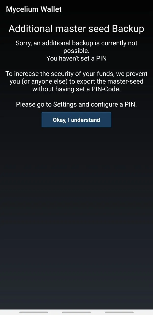
- The screen does not contain the usual "Back" button.
- The meaning of the "Okay, I understand" button is not clear. Does it allow you to proceed, help get into the settings, or just send you back? It turned out to be the latter.
- To set a pin code and go further, you need to find it in the settings, which is not easy.
- The screen contains too much text and there are no graphics. As a result, a high cognitive load, the screen creates a complex impression.
- Such a large amount of text, centered, creates visual tension and harms aesthetics.
- The button is far from the bottom of the screen, it is quite difficult to reach it.
Recommendations
- Add a "Back" button, just like similar ones on other screens.
- Rename the "Okay, I understand" button to "Return" or "Back to %Name of the previous screen%".
- Add a "Set PIN now" button, which quickly redirects to the settings, and more user-friendly, allows you to set the PIN directly on this screen.
- Reduce the amount of text and possibly add a clear error illustration.
- If it is not possible to reduce the amount of text, align it to the left edge.
- Move the button to the bottom of the screen.
Cold Storage Screen
Issues
- There is no "Back" button, which is present on other screens.
- Such an amount of text, centered, looks bad and is difficult to read.
- The buttons look as if there is no design and are inconsistent with the "Add New Account" screen.
Recommendations
- Add a "Back" button.
- Reduce the amount of text, or make center alignment.
- Use buttons across the entire width of the screen, or place several buttons in a row, use icons. You can try using round buttons in the "Get private key from:" section, the same as the Scan, Send and Receive buttons on the Balance screen.
Verify Message Screen
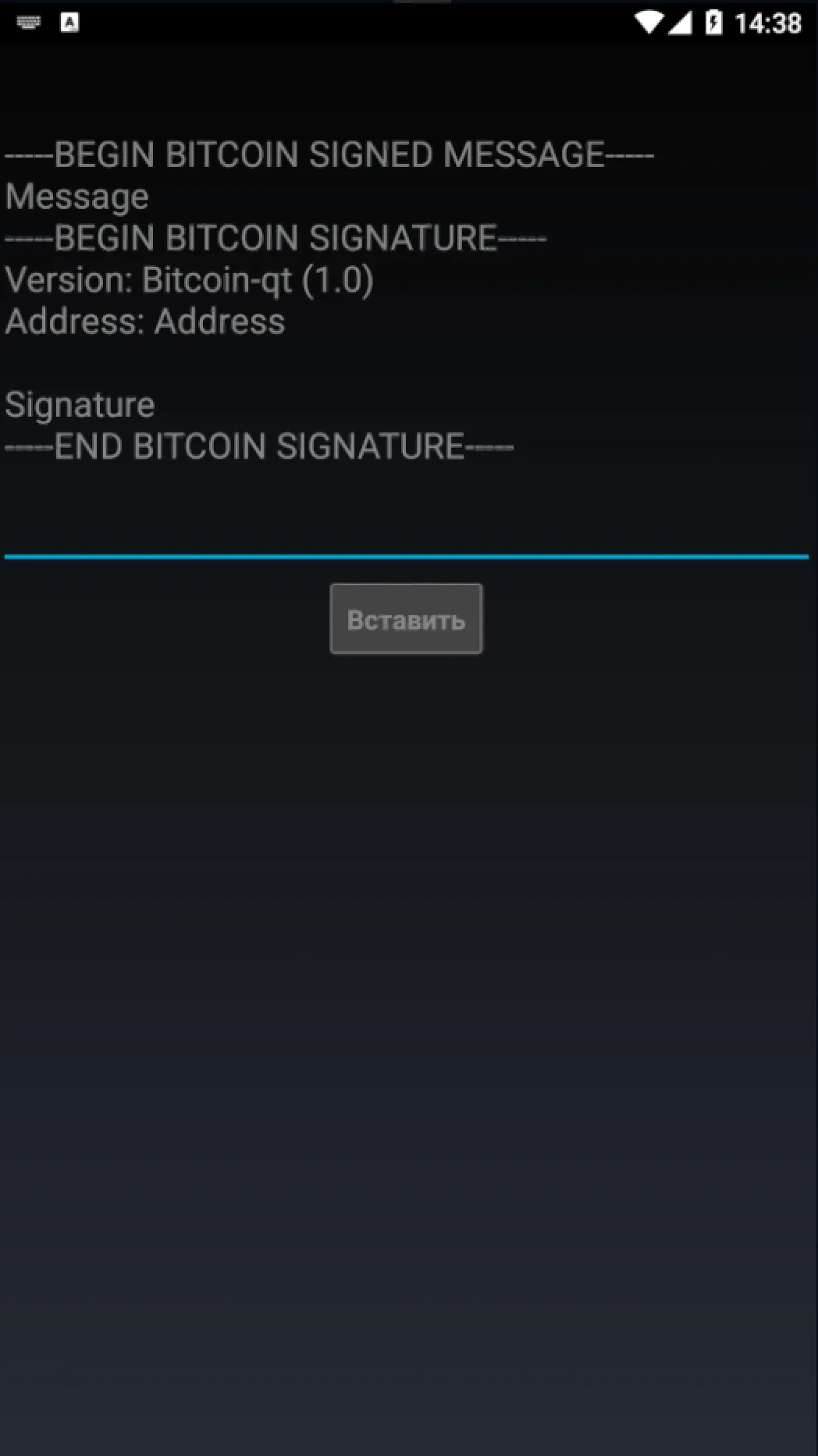
- There is no "Back" button, which is present on other screens.
- There is no introductory text to help understand the essence of the function.
- The edges of the elements on the sides go beyond the fields present on other screens of the application, which violates consistency and aesthetics.
Recommendations
- Add a "Back" button.
- Add introductory text with a description of the essence of the function.
- Observe the fields along the edges of the screen.
My FIO Names Screen
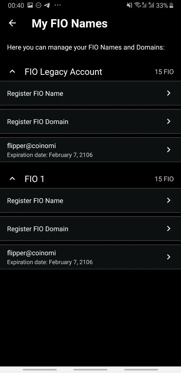
Issues
- The visual style is not consistent with other screens.
Recommendations
- Bring the visual style into consistency with other screens. By the way, a monochrome background, compared to a gradient background or a background with a picture, does not contain unnecessary elements and corresponds to the style of standard applications.
FIO Requests Screen
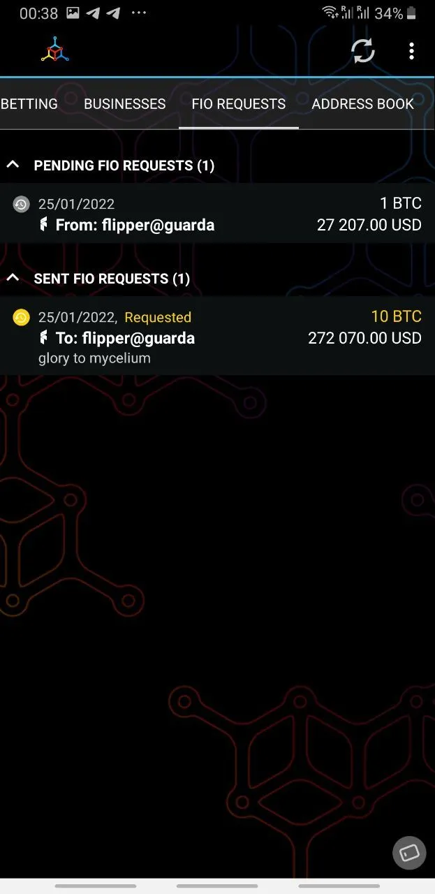
Issues
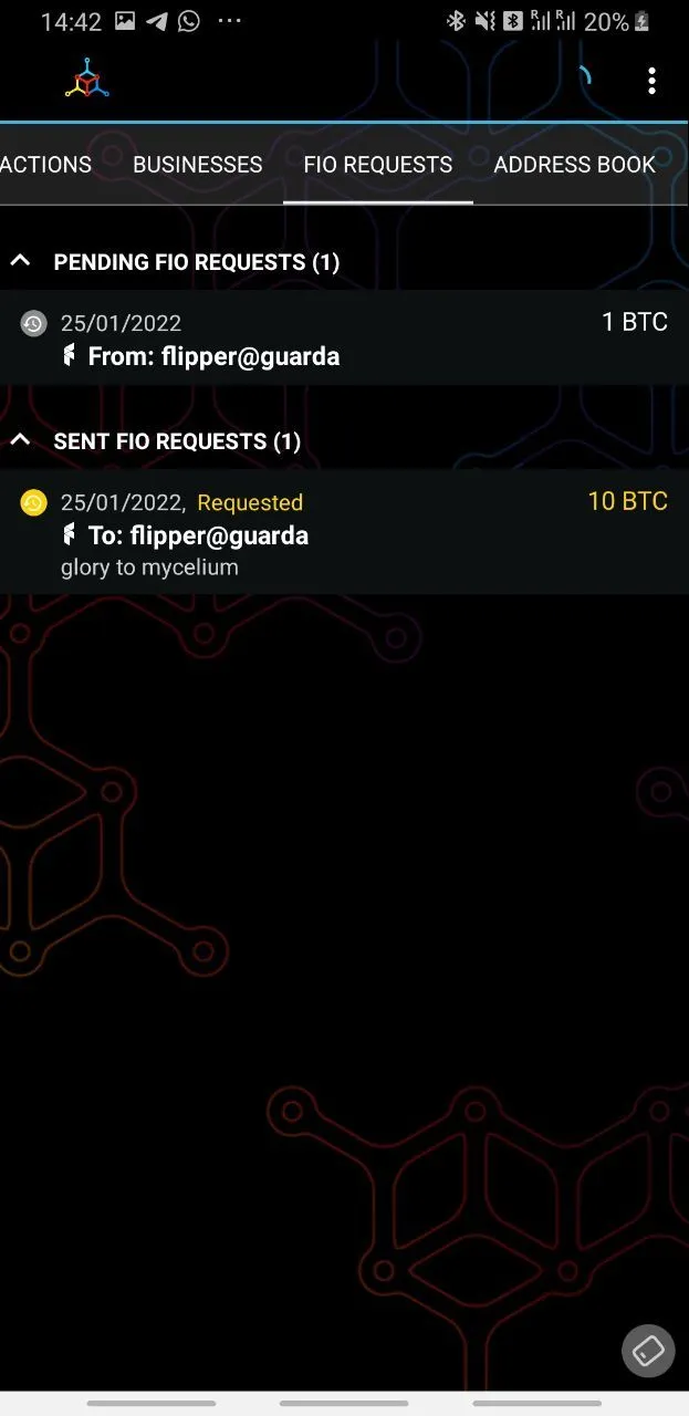
- FIO technology has not gained enough popularity in flagship products. For billing in BTC, they use the invoice function in the lightning network.
- Visual style and colors are not consistent with other screens.
Recommendations
- Transfer functions related to FIO from the main navigation to the micro-application hub screen.
- Make this screen and other application screens look consistent.
Accounts - One account selected
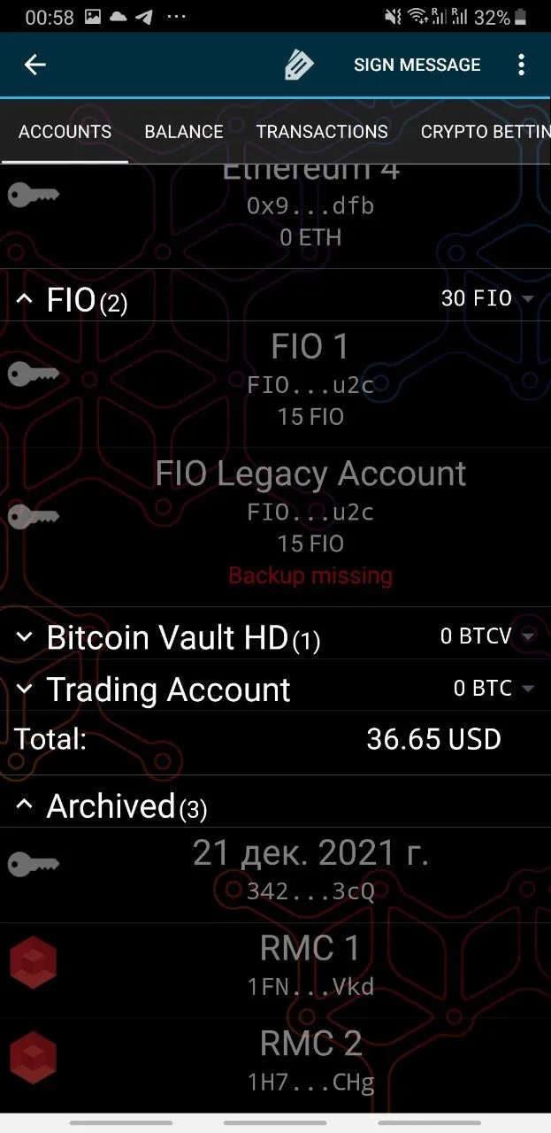
Issues
- Similar to the basic state
- The tag icon is commonly associated with tags - an array of keywords, but here it triggers a name change of the selected wallet
- The "Sign Message" button is located in an accent place, but this function is rarely needed by users.
Recommendations
- Similar to the basic state
- Replace the tag icon for renaming with the standard Rename icon with a pencil from Material Design, or leave only text.
- Move the "Sign Message" function to the hidden menu of functions on the selected wallet screen.
Accounts - One account selected - menu under "..."
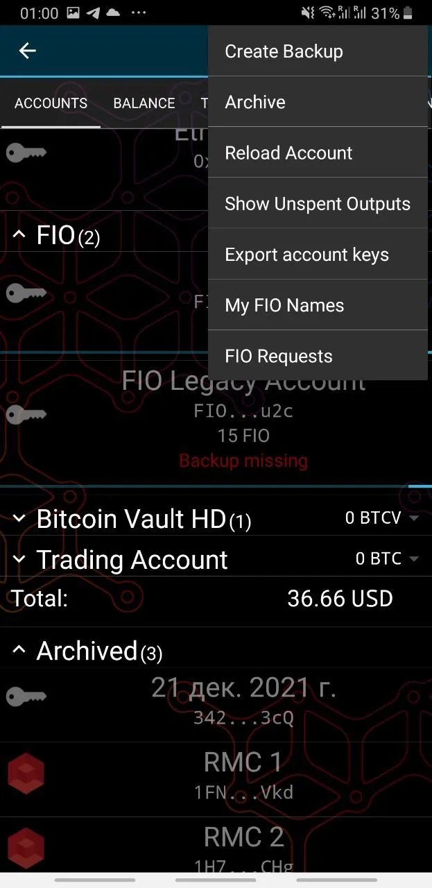
Issues
- The user does not understand the phrase "Show Unspent Outputs". It refers to HD accounts, which consist of several accounts and simply shows addresses where funds are actually located and their balances.
- The "Show Unspent Outputs" function is displayed for non-HD accounts, but this function is unnecessary for them.
- The first 5 items relate to a specific account, while "My FIO Names" and "FIO Requests" do not relate to a specific context.
Recommendations
- The "Show Unspent Outputs" call point is better to move to the balance screen and rename it to "Show addresses with balance".
- Do not show "Show Unspent Outputs" at all for irrelevant accounts.
- Remove "My FIO Names" and "FIO Requests" items from this context menu.
Balance Screen - common for all types of wallets
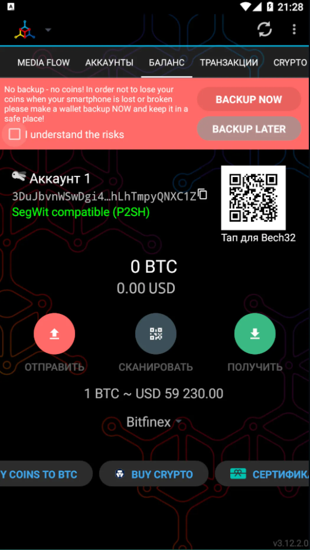
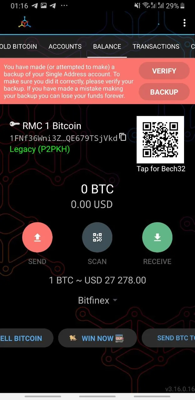
Issues
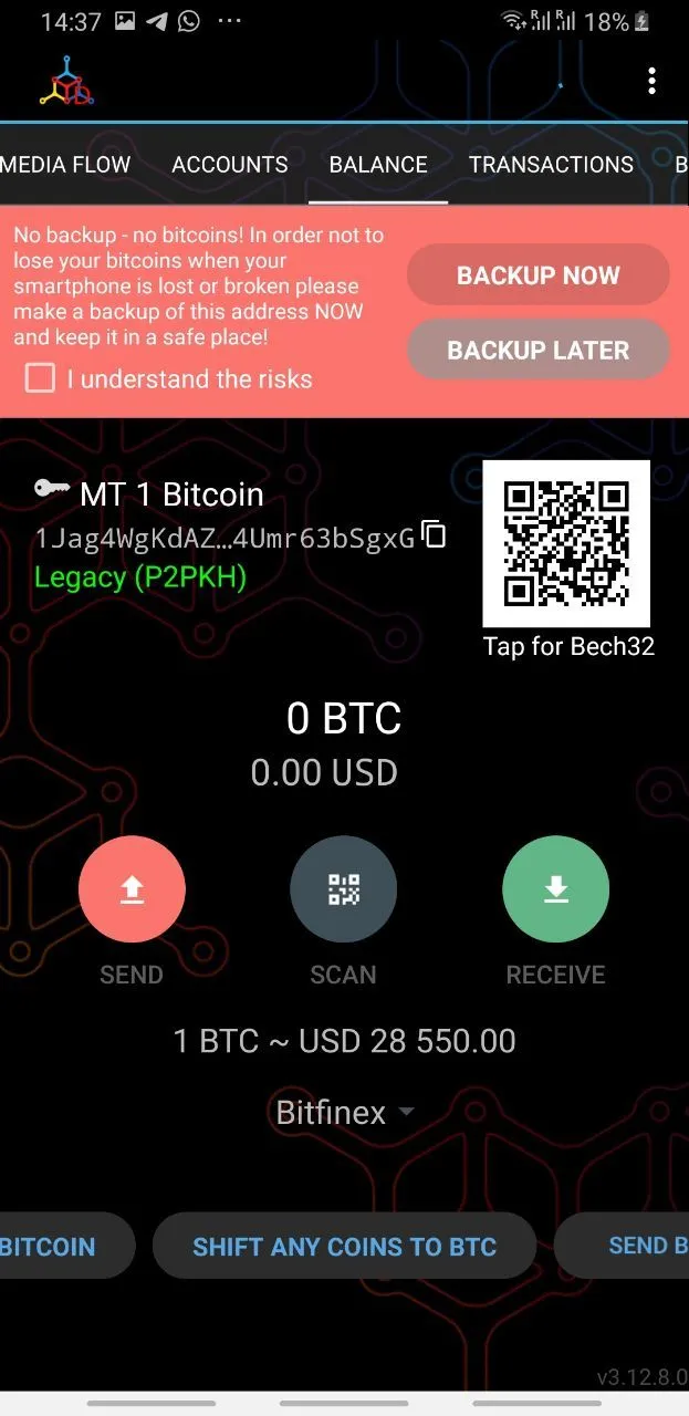
- The captions under the Send, Scan, and Receive buttons do not have sufficient contrast according to the WCAG standard.
- The screen does not show the full name of the coin (token) and the network to which it belongs (for example, ERC-20), which can be misleading if wallets of one coin in different networks have different names (for example, the Bitcoin token in the RMC network and just Bitcoin).
- The element showing the exchange rate of the asset on the exchange with the exchange selection button unnecessarily takes up a lot of space in the vertical plane.
- Using the chips element to show a long list of buttons in the form of a carousel, some of which lead to referral links of partners, and some to micro-applications within the wallet is extremely inconvenient. Some services can be overlooked. Once clicked on one button and realized that it's just an ad, the user might think that other buttons in this carousel are also ads.
- According to the Material UI guidelines, the Banner (an element reporting backup problems) should contain text at the top and action buttons at the bottom.
- It is not recommended to use types of buttons different from the Text Button in the banner to avoid excessive attention.
Recommendations
- Use more contrasting to the background color of the text for the captions of the Send, Scan and Receive buttons.
- Display the full name of the coin and the currently selected network on the screen.
- Place the element showing the asset exchange rate on the exchange and the exchange selection button in one line.
- You can place the buttons from the chips carousel in the form of vertical text links in a row, which will give a stable and memorable position in the interface to the micro-applications that were in this carousel.
- Re-arrange the banner about backup problems so that the text is located in its upper part, and the action buttons in its lower part.
- Change the style of the buttons in the banner to Text Button.
Balance / Send
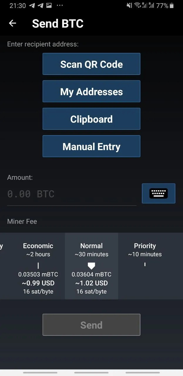
Issues
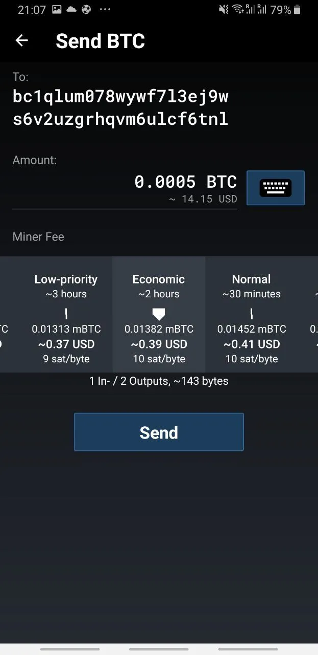
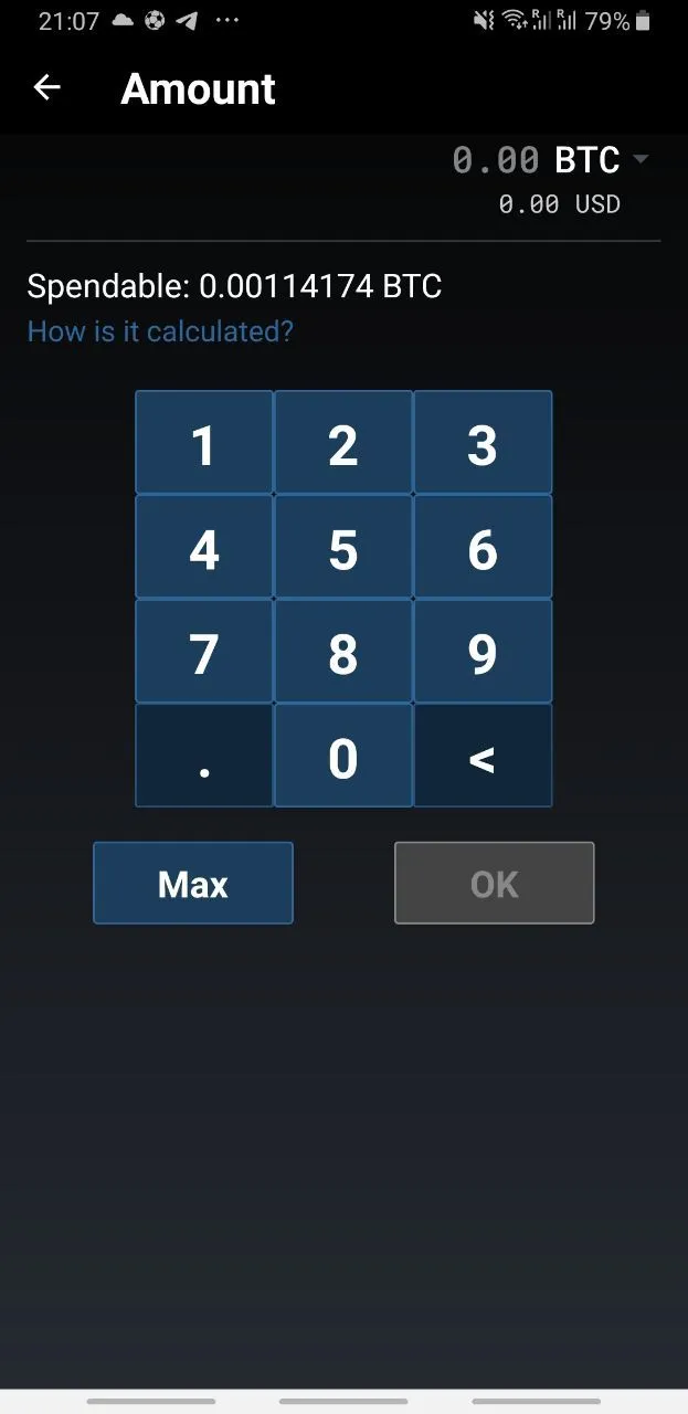
- 4 buttons in a column look very ridiculous. You need to read the text on each button, and after indicating the address, the elements below shift.
- Among the many options for substituting an address, there is no way to send coins to the last address
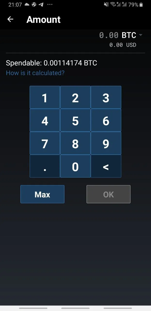
- When you click on the input field of the amount, it shifts, and the keyboard appears in an unfamiliar place, which causes discomfort for the user.
- The button to increase the transaction volume to the entire user's funds is located on the digital keyboard, which is not a familiar place, while
Balance / Send
Problems
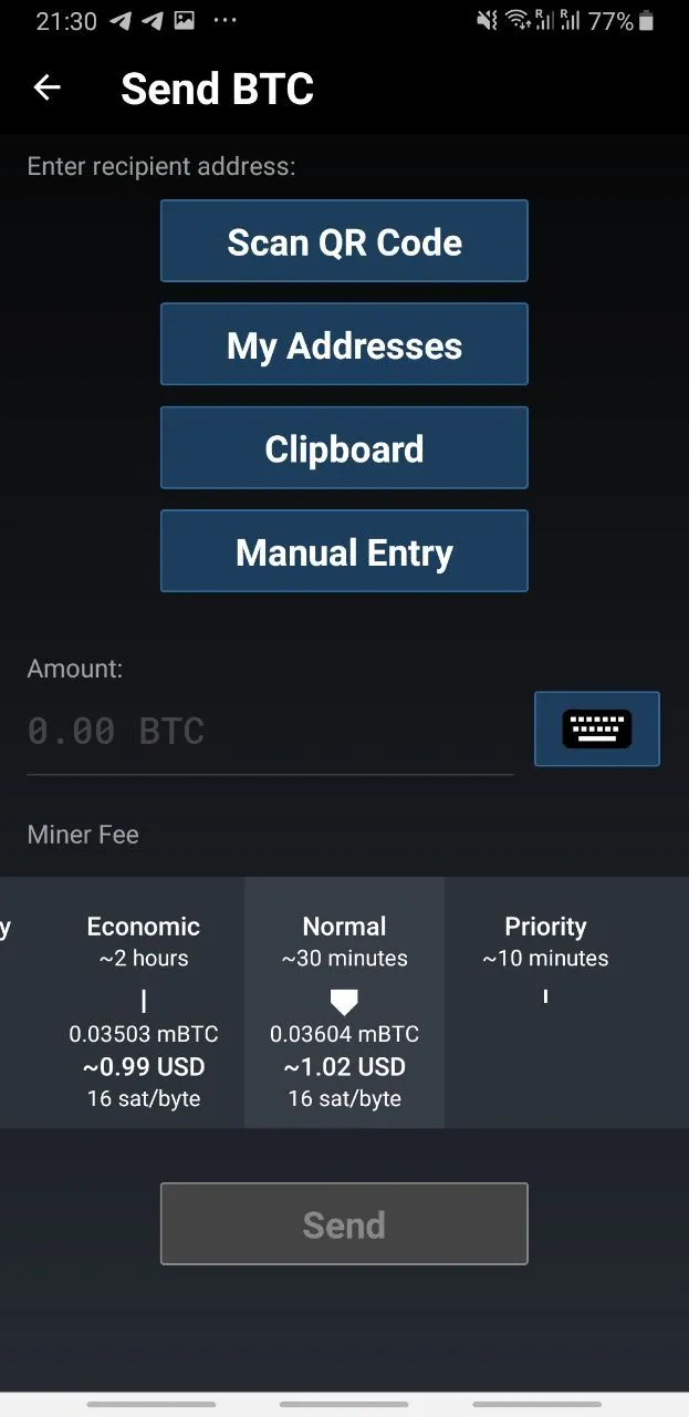
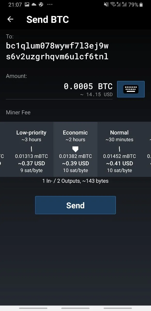
- 4 buttons in a column look very silly. The text on each button needs to be read, and after indicating the address, the elements below are shifted.
- Among the many options for address substitution, there is no ability to send coins to the last address.
- When you click on the amount input field, it shifts, and the keyboard appears in an unusual place, which causes discomfort for the user.
- The button to increase the transaction volume to the full amount of the user's funds is located on the numeric keyboard, which is not a usual place, while logically it is more associated with the element showing the total account balance.
- If the user chooses too low a commission, he does not fully realize that the transaction may be delayed.
- The transaction speed calculation mechanism works incorrectly. Having chosen a commission with a calculated arrival time of 2 hours, the coins were credited after 4 hours. The combination of this problem with the previous one causes a noticeable share of support tickets and negative reviews on Google Play about the transaction getting stuck.
Recommendations
- To choose the source of the address, use a more familiar and intuitive component. For example, a text field, on the right side of which there will be buttons-icons for pasting and scanning QR, to the right of the text "Enter recipient address" you can place a text button "Address Book", and when the text field is in focus, show the last used addresses.
- Add the ability to substitute one of the 5 last sent addresses.
- At the beginning of the amount input, leave the input field in the interface in the same position and form. If necessary - hide or darken the elements below the field. It's better to use the standard keyboard, and if you use your own, it should be located in the usual place.
- It's better to place the Max button in the form of a text button near the line indicating the account balance.
- If a low commission is chosen, show a warning that the transaction may take too long.
- Change the data source for calculating transaction execution speed.
Balance / Scan
Problems
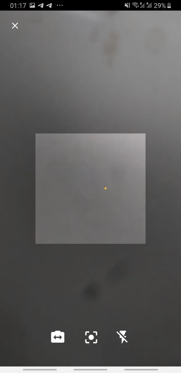
- The button for scanning is not needed, because the continuous scanning process is already going on and the scanner closes as soon as a QR code comes into view.
Recommendations
- Remove the scanning button.
Balance / Receive
Problems
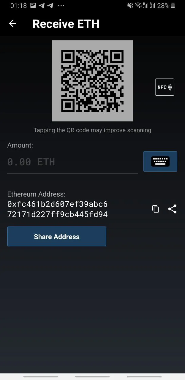
- The Share Address button is duplicated by the icon.
- The QR code is not large enough and it may be difficult to scan it with a poor camera.
- If the user uses an HD account to hide their assets from counterparties, then here you cannot choose an address related to his HD account, to which he wants to receive funds.
Recommendations
- Remove the Share address button duplicate.
- Make the QR code larger.
- Add the ability to choose an address to receive on HD accounts.
Balance Screen - for Bitcoin wallets
Problems
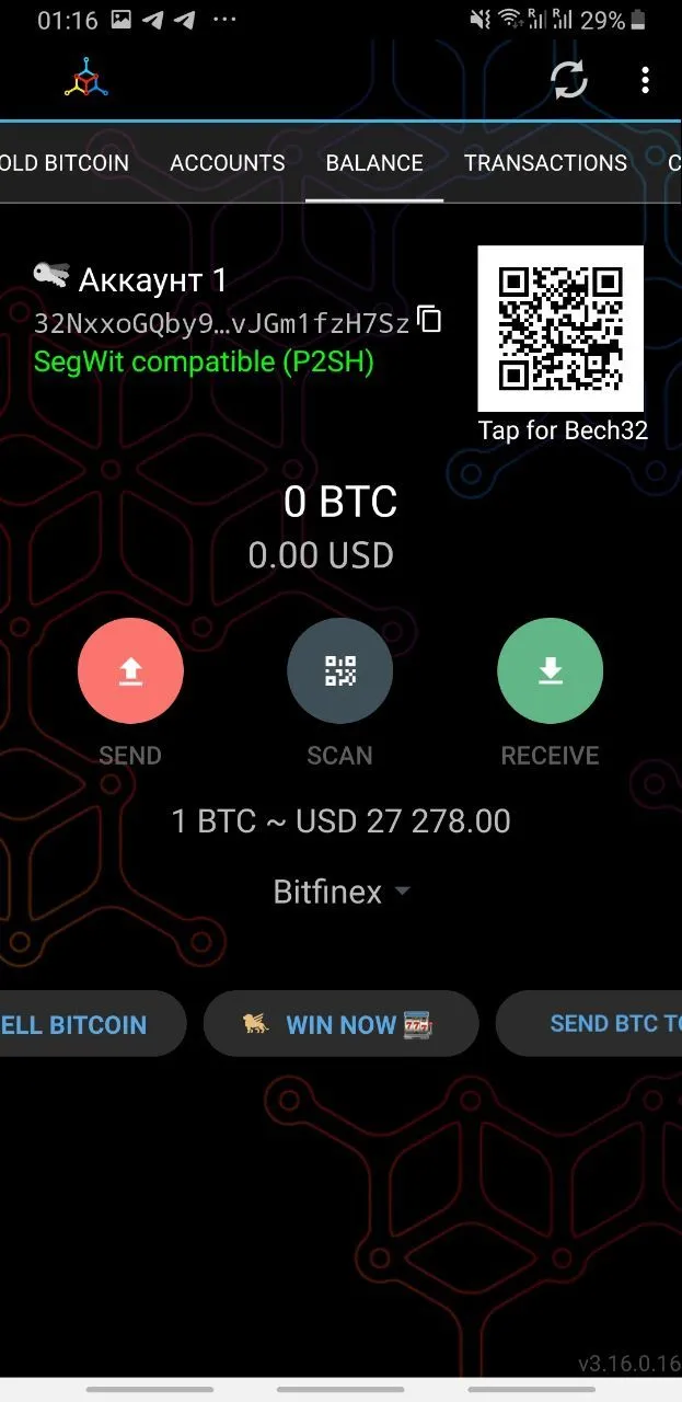
- It is not intuitive that bitcoin has 3 different address formats and what their advantages are. To switch, you need to click on the QR code, although users are more accustomed to clicking on the QR code to expand it to full screen.
Recommendations
- Make the address type selection a three-position switch (P2PKH, P2SH, Bech32). Next to it, place a button (?), which opens a popup with detailed information about what it all means.
Balance Screen - for Bitcoin wallets with HD enabled
Problems
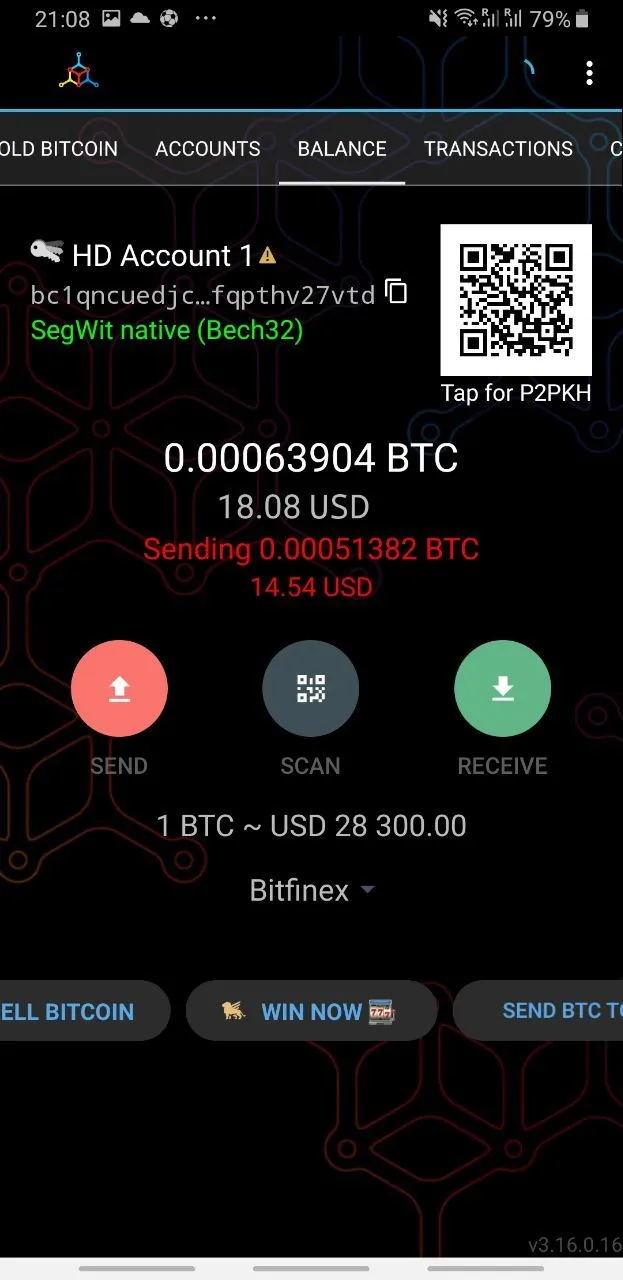
- There is no information on the screen that the wallet is in HD mode. This can only be understood by the icon with three keys, which is poorly visible and not intuitive.
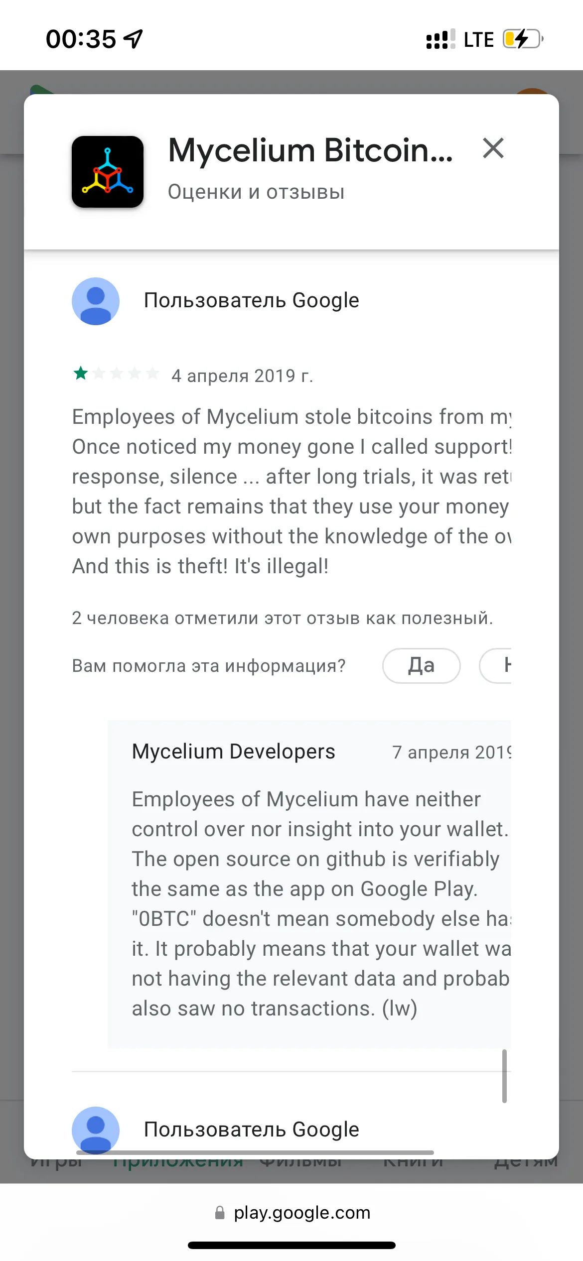
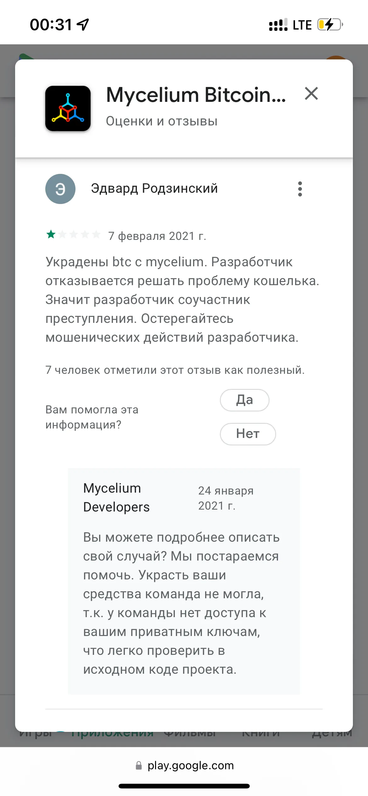
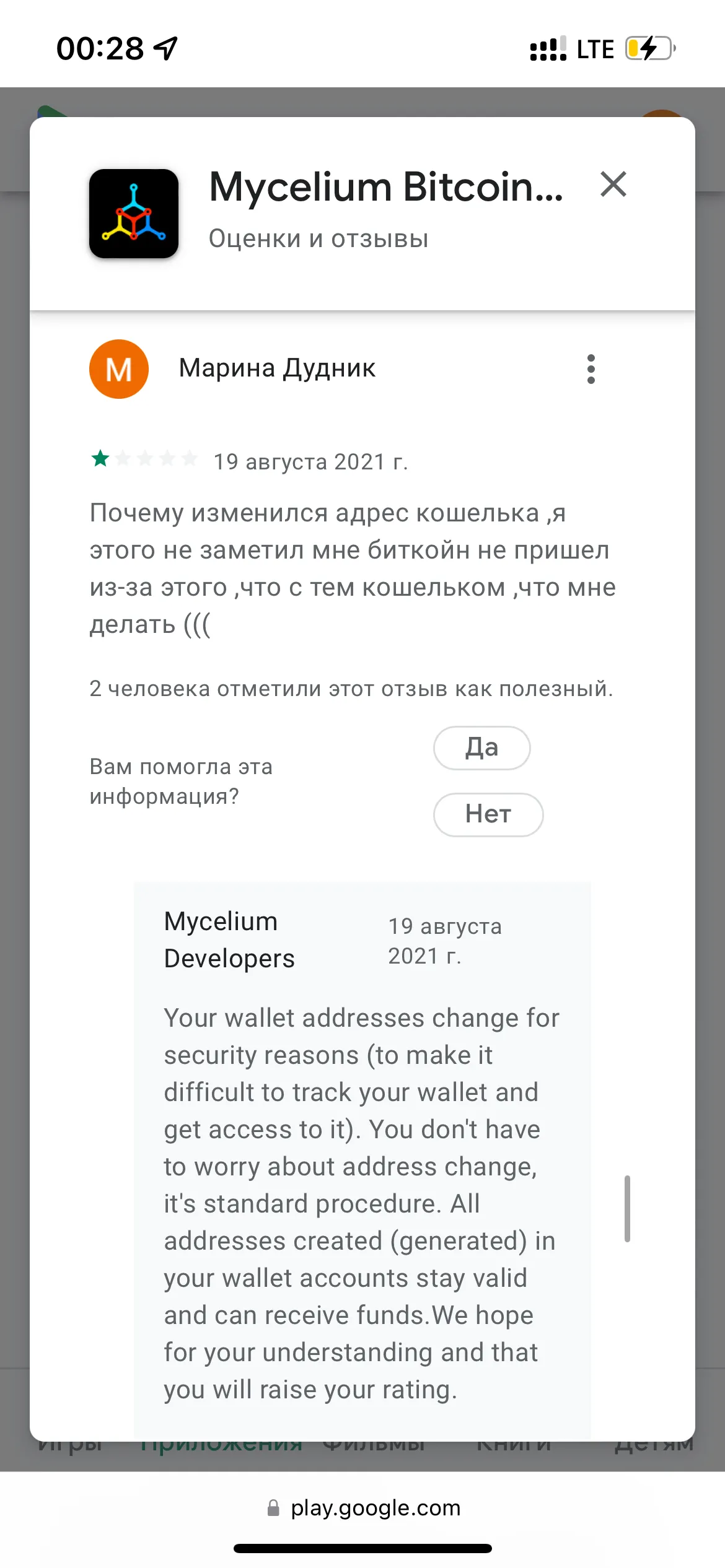
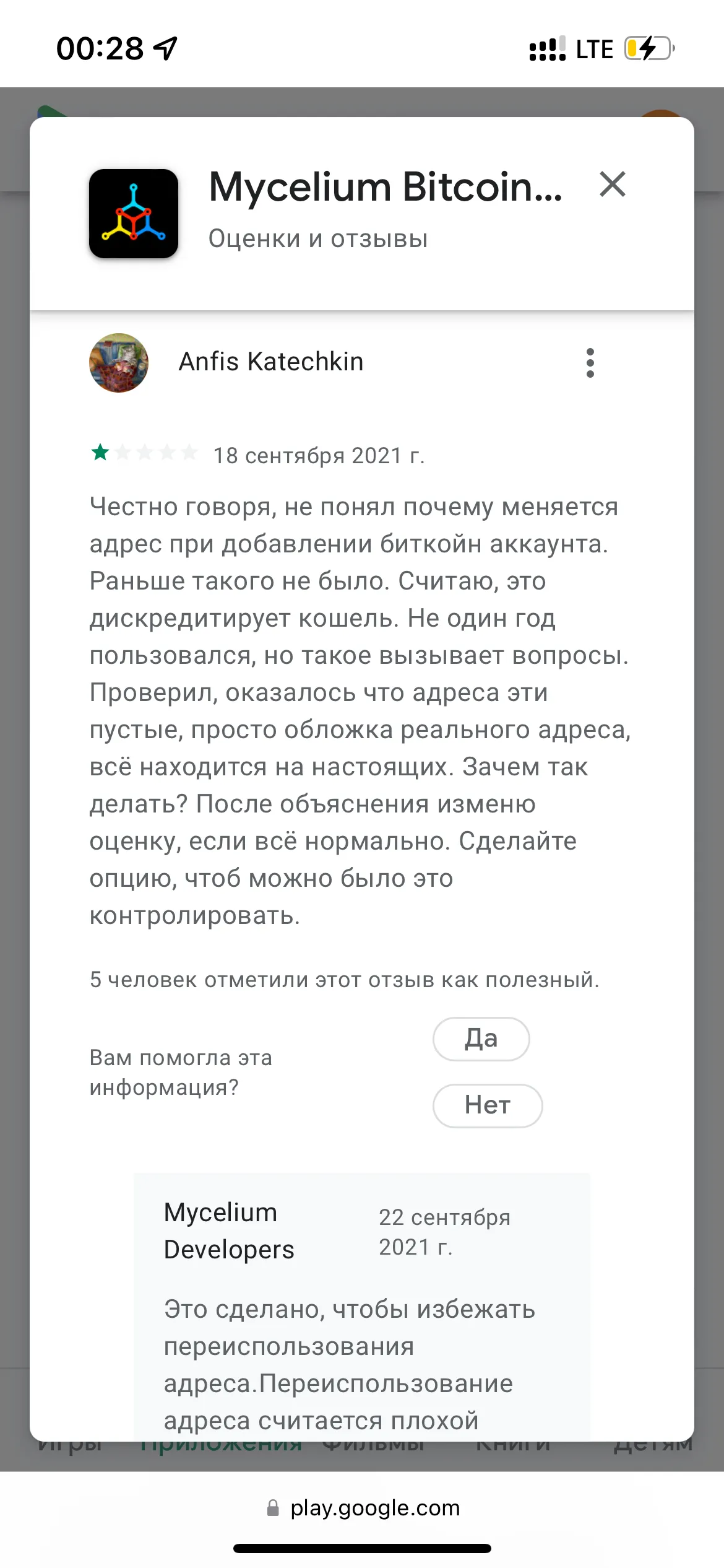
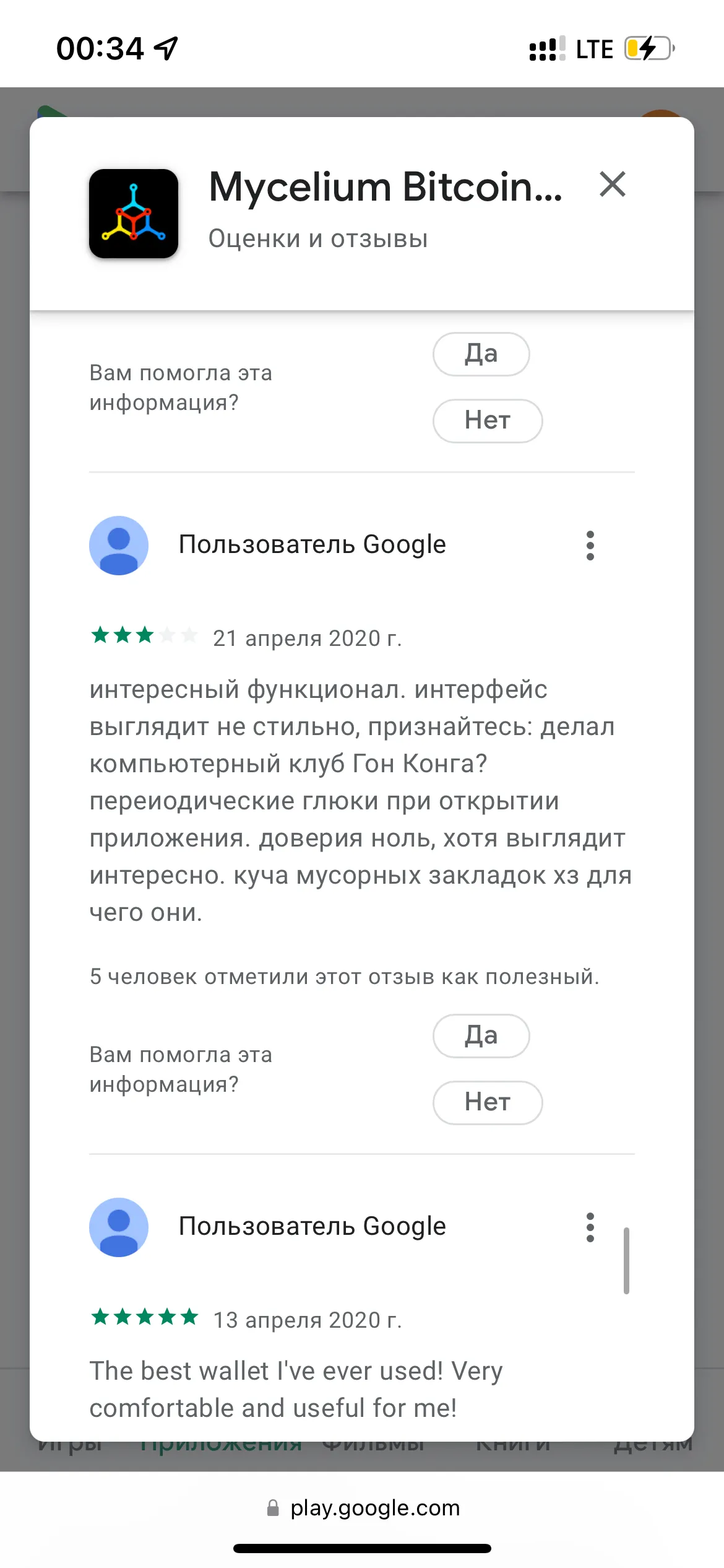
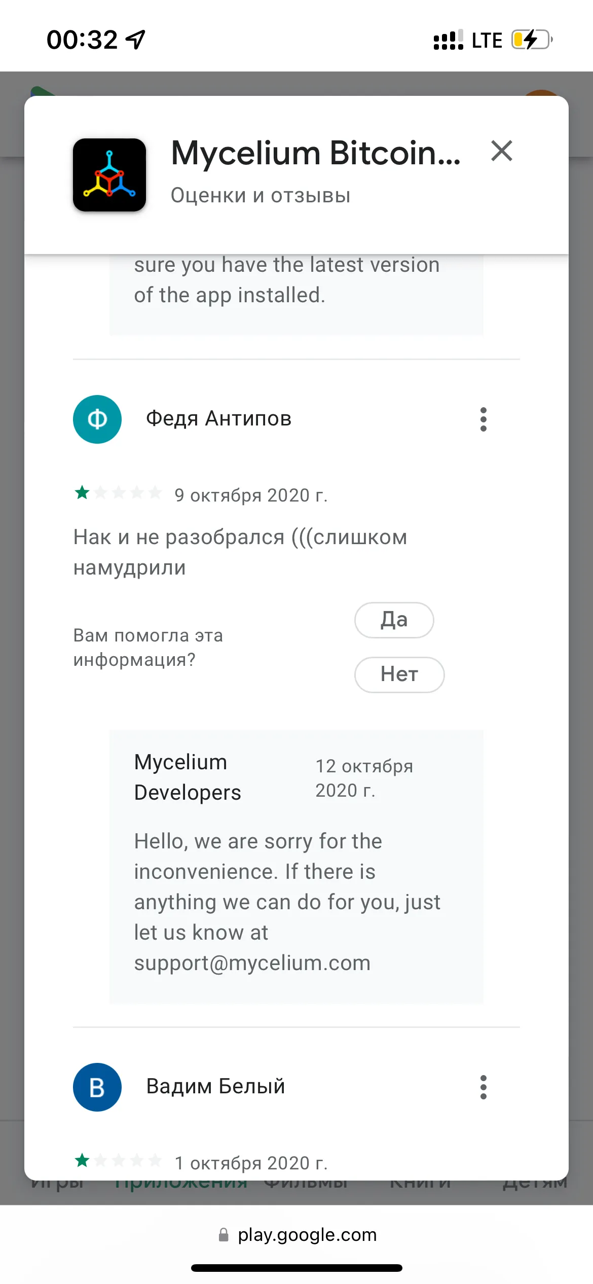
- There is no entry point to a popup that would explain the peculiarity of the HD account and why the wallet balance, the address of which is now displayed on the screen, is empty. People do not understand the principle of work and accuse the Wallet of stealing funds in reviews in the Play Market.
- There is no button to view balances at addresses. It is also missing in the menu under the "..." button. You need to go back to the Accounts section and look for this function in the menu under the "..." button there.
- From this screen, you cannot understand how many addresses this wallet uses.
Recommendations
- Add an indicator to the corner of the screen that the wallet is in HD mode.
- Next to the HD mode indicator, add a button-icon that calls a pop-up window explaining how HD mode works.
- Not far from the indicator, place the “View all addresses” button, which would show on which real addresses the balance is stored.
- Indicate on the screen how many active addresses the account has, or integrate this number into the button from the previous point, for example, “View all 6 addresses”.
Transactions Screen
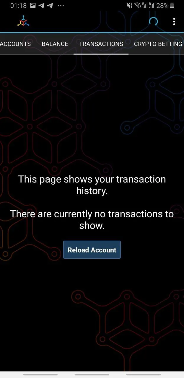
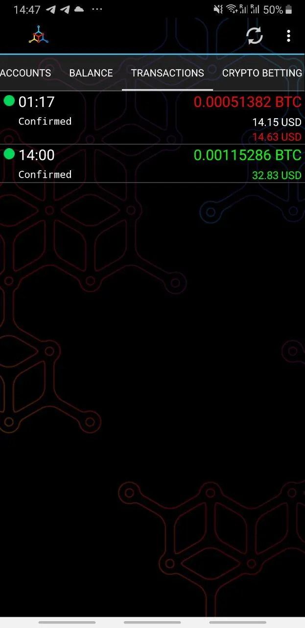
Problems
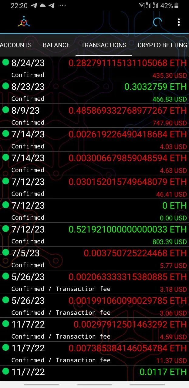
- Excessive use of colors on the text makes it difficult to read and the selected shade of red has insufficient contrast according to the WCAG standard.
- In the Ethereum network, expenses related to interaction with smart contracts are not marked.
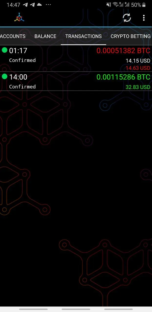
- Often several transactions are made in a day, but the interface does not show the time of the transaction.
- Amounts with a large number of digits after the decimal point are difficult to compare when they are aligned to the left, and in standard list items in Material Design, the date is usually located on the right.
- There are not enough explanations when there are many transactions. For example, tags about who and what the money is being transferred for, or which service was interacted with.
- The linear separator between transactions creates visual noise, and the text relating to different transactions is closer to each other than the text relating to a single transaction.
- In Ethereum, fees are displayed as separate transactions, and in Bitcoin, the equivalent amount of the transaction in dollars and the equivalent amount of the transaction in dollars, taking into account the commission, are displayed next to each other. The user does not understand and thinks that one of the numbers is the paid commission.
- It is unclear what to do if the transaction is stuck and has not been executed for several days.
Recommendations
- Abandon the use of colors to denote expenses and accruals, and use icons to denote the direction of debits and/or a minus in front of the number in debit operations.
- In addition to icons for displaying cryptocurrency sends and receipts, use an icon to denote interaction with smart contracts.
- Show the time of the transaction under the date instead of its status, and show the status graphically.
- Place the amounts and their equivalent in dollars on the left, and the dates and times on the right.
- Display explanations for transactions as a third line when available.
- Remove the separators and express that the text relates to different transactions in the language of distances between the text: the gaps between texts related to different transactions should be larger than the text elements that together form information about one transaction.
- Do not show commissions or the amount of the transaction volume and commission in the general list similar to other wallets, so as not to mislead the user.
- If the transaction takes more than three hours, show a message under it with a proposal to call the function of adding gas to the transaction.
Specific transaction screen
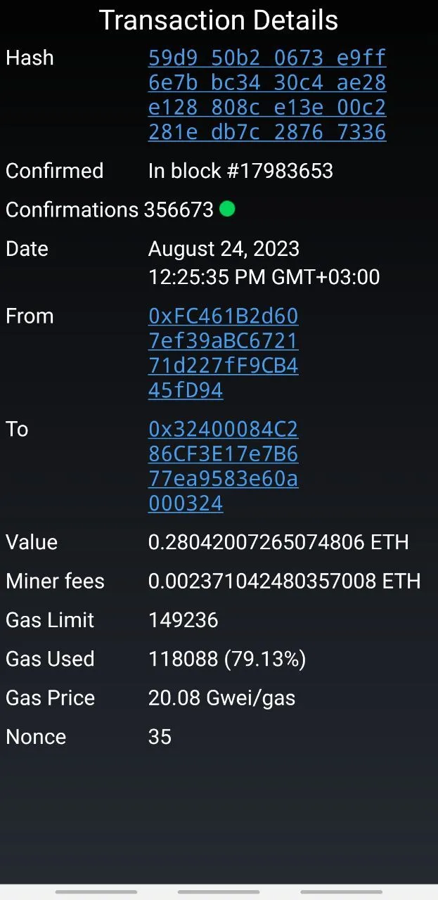
Problems
- If the transaction gets stuck, there is no way to "push" it by increasing the commission, this problem is very often faced by people in reviews on the Play Market.
- The equivalent of the transaction amount and the miner fee in dollars at the time of sending is not shown, although it is in all other parts of the application.
- The fields on the sides are not observed.
- There is no back button and the distance from the header to the top edge and to the content is too small.
- A larger font size is used, so on devices with a small screen, all the text may not fit.
- You cannot add the sending address to the "Address Book".
- It is not intuitive that address would be copied when user will do a long press.
Recommendations
- Add the "Bump transaction" feature with an increased commission to an already sent transaction.
- Show the equivalent of the transaction amount and miner fees in dollars.
- Add fields on the sides, consistent with other screens.
- Add a top panel with a "Back" button and a title, consistent with other screens.
- Use the same font size as in other pop-up screens.
- Add a button opposite the recipient's address with the ability to add the recipient's address to the "Address Book".
Businesses Screen
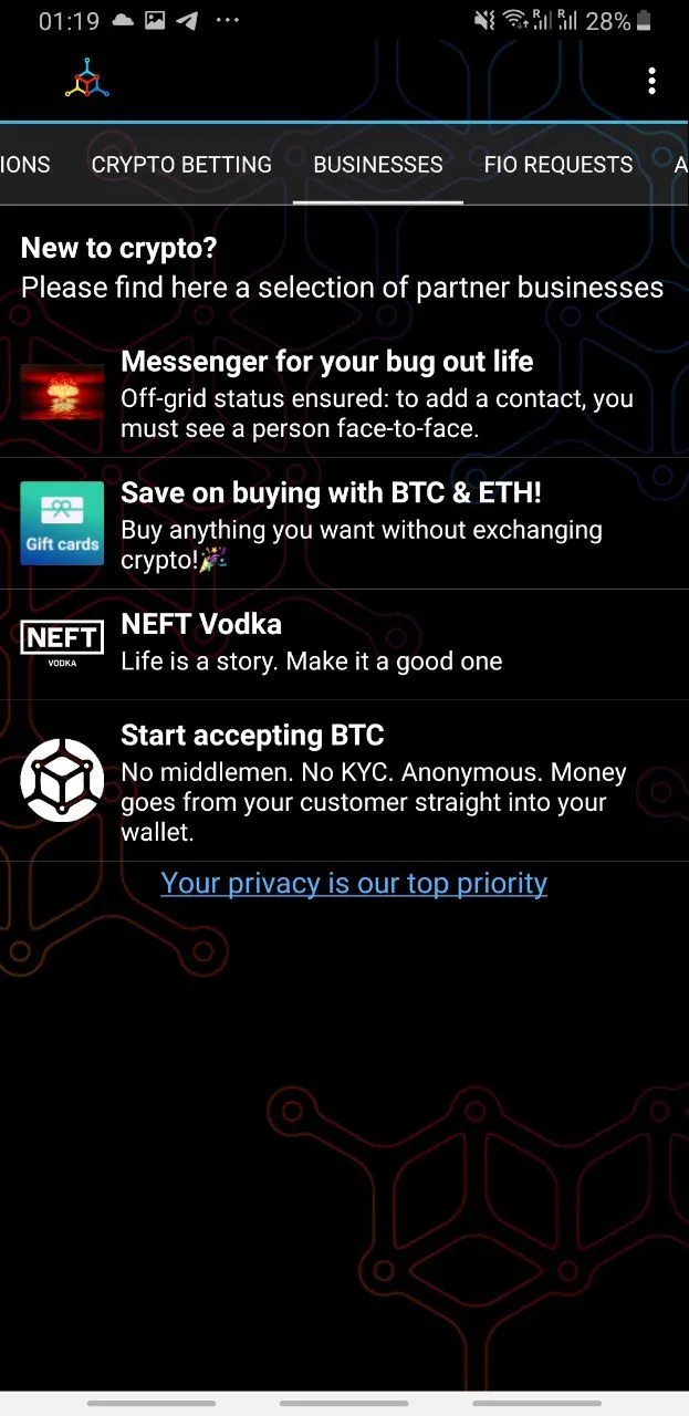
Problems
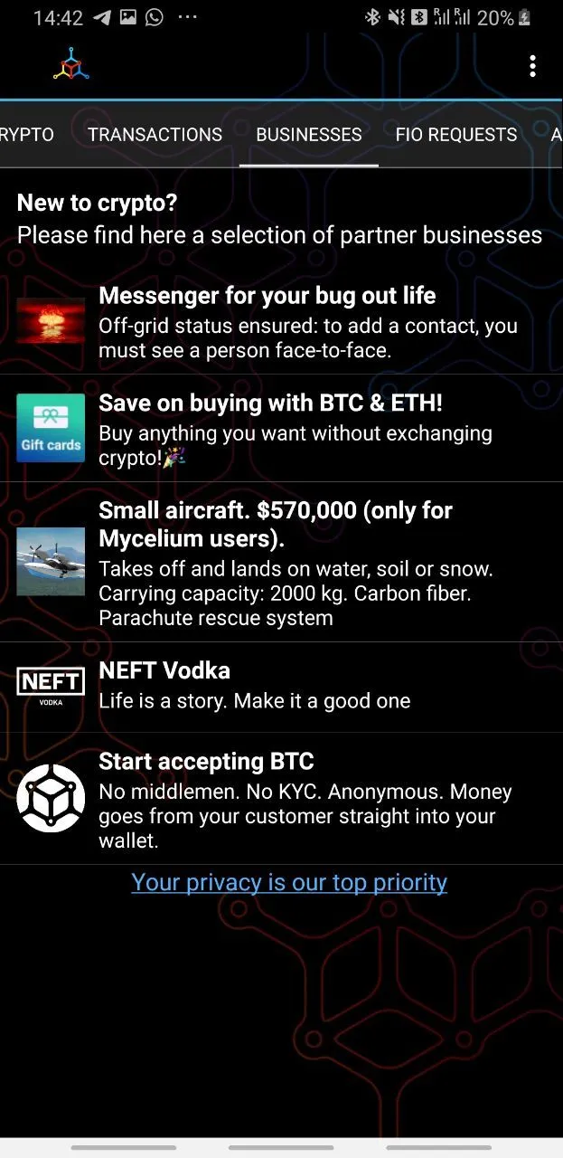
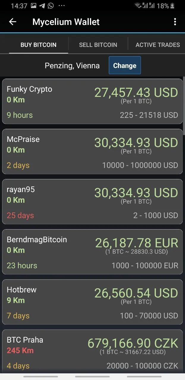
- The concept of a separate section for partner advertising seems strange, as this section can also be hidden in the settings.
- The text in the title suggests that these projects should be useful to cryptocurrency beginners, but there is vodka advertising in the list here.
Recommendations
- Place advertising in accordance with the context in different parts of the application, or integrate the use of partner services into the functionality of the application.
- Remove irrelevant advertising from the application.
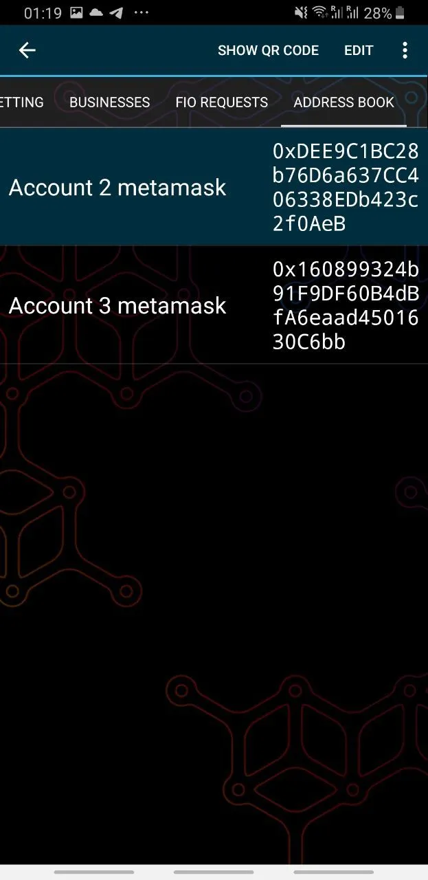
Address Book Screen
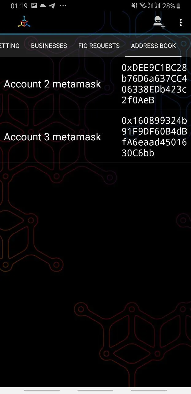
Problems
- The screen does not follow the fields around the edges of the screen.
- The screen unjustifiably uses too large a font size.
- In the current composition, the address is transferred several times. Perhaps this is done to simplify the comparison of addresses, but it looks messy.
Recommendations
- Follow the fields around the edges of the screen.
- Reduce the font size.
- To display entries, it is better to use the List element from Material Design. In it, elements are arranged in one row, and you can also add an icon to the left (logos of popular exchanges, wallets, images of people), which the user will be able to choose when adding a new entry.
Address Book - Existing Entry
Problems
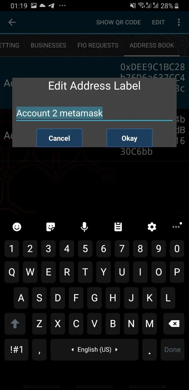
- The QR code display function calls a similar to the point of confusion screen with the function of displaying the address of your own wallet. The warning message is too long and written too small. There may be a situation where the user unlocks the phone and presents the wrong QR code.
- The button to change the name of the address is called "edit", which implies that not only the name can be changed, but this is not the case.
- The fields at the top and bottom are violated in the pop-up window for changing the address name. It feels like a standard Material UI component with link buttons was taken, and styles were unsuccessfully imposed on it.
- It is expected that the "Show QR-code" button will simply show the QR code of the wallet, but it opens a screen where, in addition to the QR code, the address can be copied, and also generate an invoice link for the amount specified by the user.
- The address book seems like a reasonable entry point into the script for sending coins to the specified address, however, this cannot be done.
Recommendations
- Change the design of the screen so that the user cannot confuse it with the screen for receiving payment to his own account.
- Rename the "Edit" button to "Rename".
- Correct the fields at the top and bottom in the pop-up window to acceptable ones, or use link buttons at the bottom.
- Rename the "Show QR-code" button to "Share address".
- Add an entry point into the script for sending coins to the highlighted address.
Address Book - Adding a New Entry
Problems
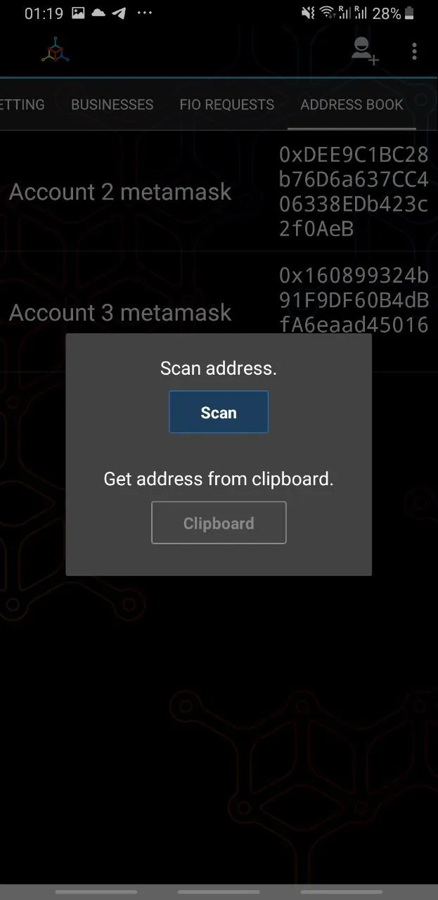
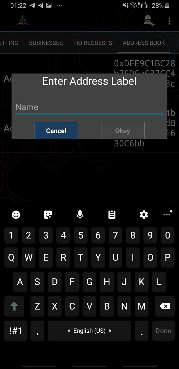
- The popup window does not contain a close button.
- The window uses text components, although a graphic component that is intuitive and familiar to users can be created from the standard Material UI elements.
- If the user wants to add an address to the Address Book that he is forced to rewrite, he will not be able to do it.
- After inserting the address, it is impossible to check it until you assign a name and return to the main "Address Book" screen.
Recommendations
- The popup window should have a close or cancel button consistent with other parts of the application.
- Instead of two labels and two buttons, you can use a text field with insert and QR code scanning icon-buttons on the right.
- Both stages of adding an address can be fit on one screen.
6. Navigation Assessment
The navigation in the app is extremely confusing and unfamiliar to new users.
Problems with the Composition of Main Tabs
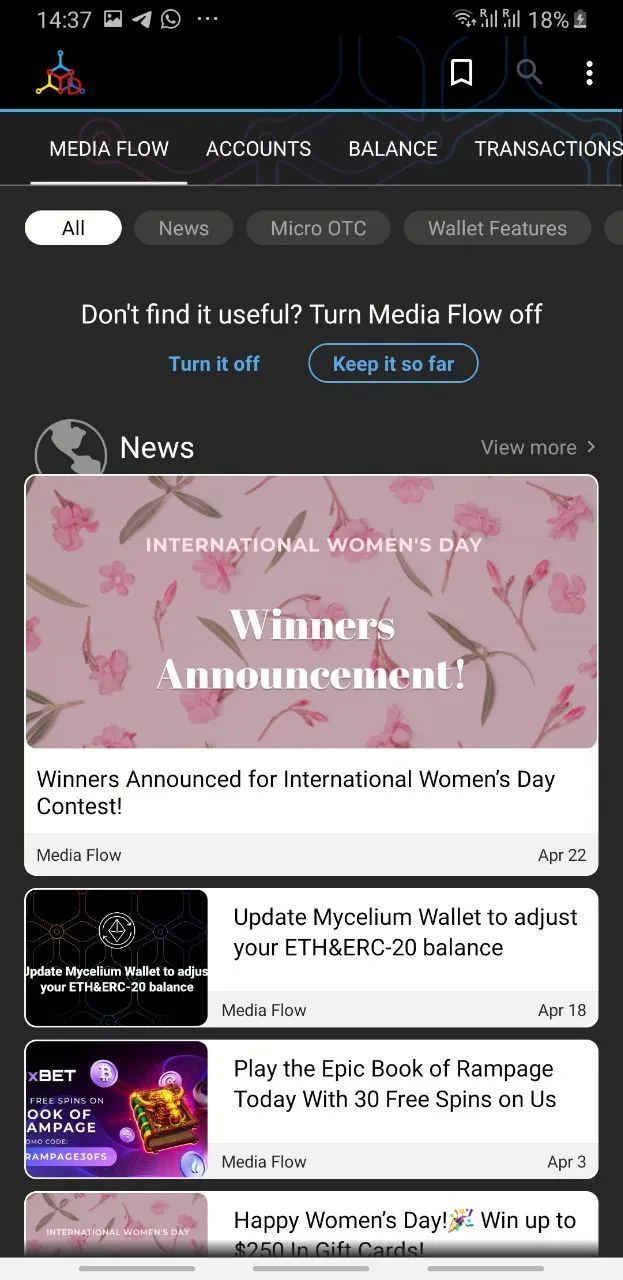
Currently, the main navigation feed of the application contains 9 tabs, first-level navigation screens: Media Flow, Gold Bitcoin, Accounts, Balance, Transactions, Crypto Betting, Businesses, FIO Requests, Address Book.
In fact, there are three main application screens aimed at implementing the main functions (sending and receiving cryptocurrency): Accounts (wallet selection), Balance (current account and related actions) and Transactions (account transaction history). The user will often return to the Accounts screen if he works with several wallets, and the Transactions screen is fully associated with the same account that is active on the Balance tab. Thus, we can nest the Transactions screen inside the Balance screen.
Screens like Gold Bitcoin, Crypto Betting and Businesses just lead to referral links and complicate first-level navigation. The FIO Requests screen relates to a technology that has not gained proper distribution and is not supported by flagship exchanges and wallets, and therefore clearly does not deserve a place in the application hierarchy higher than the "Gift Cards" section. Media Flow, as a conversion element, and Address Book, as complementing the main functionality, have the right to be in general navigation.

Problems with Navigation Elements
The wallet uses the Tabs element from Material UI at the top level of the hierarchy. According to its definition from Material Design Guidelines:
Tabs organize and allow navigation between groups of content that are related and at the same level of hierarchy.
The use case scenario of the Tabs component in Mycelium Wallet violates this rule, as the Balance and Transactions tabs are subordinate to the Accounts tab.
The main navigation of the application at the top of the screen is inconvenient for the user, as the thumb holding the smartphone is usually located in the lower half of the screen.
The Bottom Navigation component has been specially developed in Material UI for implementing top-level navigation, which allows showing from 3 to 5 destinations.
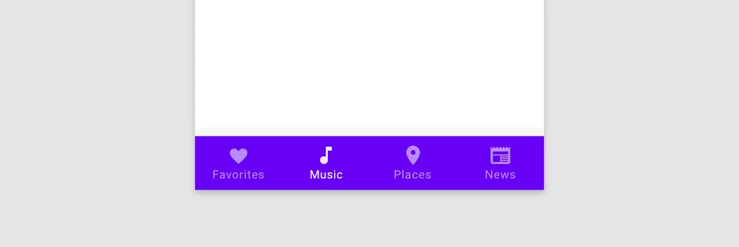
Navigation Scenario Issues
Scenario example with guidelines violation
Mycelium uses an unusual pattern, where a click on a list item does not cause a transition inside it, but changes the top panel (App Bar) to a panel with contextual actions (Contextual Action Bar). This contradicts the Material UI guidelines for implementing the selection function:
On touch devices, select items using:
A long-press touch or two-finger touch
A selection shortcut, if available, such as tapping an avatar
This error occurs in several places:
- Clicking on an account in the Accounts tab causes the account to be selected for work with it in the Balance and Transactions tabs and the appearance of contextual actions on the Accounts screen instead of going inside the account.
- Clicking on an entry in the Address Book section causes contextual actions to appear with this entry instead of expanding the entry card to full screen.
It turns out that a good idea might be to leave the Accounts screen in the primary navigation at the first level, and the Balance screen with the integrated entry point to the Transactions screen should open when you click on the desired account.
Problems in the location of secondary functions
The app has a sense of confusion, disjointed navigation. To test this hypothesis, we built a User Journey Map for the main and secondary micro-applications and their entry points. We have not indicated obvious nested functions here (for example, sending and receiving coins in the Balance section), but we indicated all disjointed functions and mark those that are directly related to their entry point with solid lines, and those that are not related to their entry points with dotted lines.
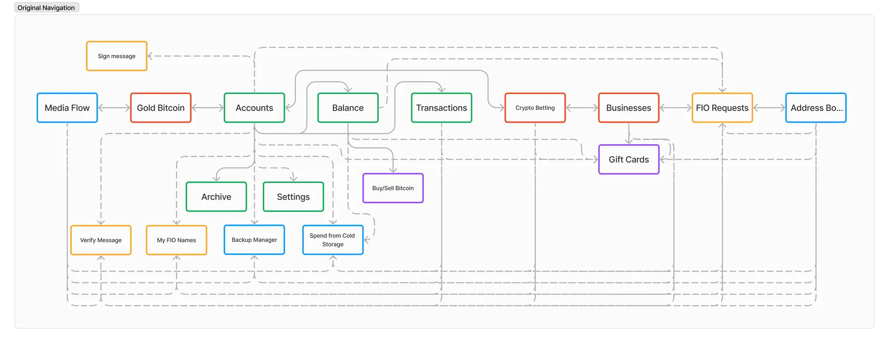
Microservices were grouped into categories, denoted by colors on the diagram:
Green - main app functions related to wallet display,
Blue - utility functions that are used less frequently than the main ones but are important for efficient use of the app.
Orange - utility functions that are clearly not in their places, as stated in the audit results in section 5.
Purple - useful microservices that generate profit
Red - purely promotional functions.
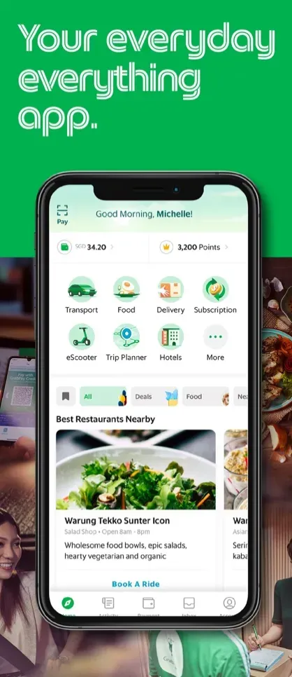
We see that we have a pool of functions that are isolated, and their entry points are little related to them. These functions: Verify Message, My FIO Names, Backup Manager, Spend from Cold Storage, Gift Cards, FIO Requests. It seems that the Businesses screen was initially conceived as a hub for calling various conversion microservices embedded in the app. There is now a super-app practice: when many small ones are included in a single app, and one of the screens acts as a common entry point for micro apps.
Recommended Solution
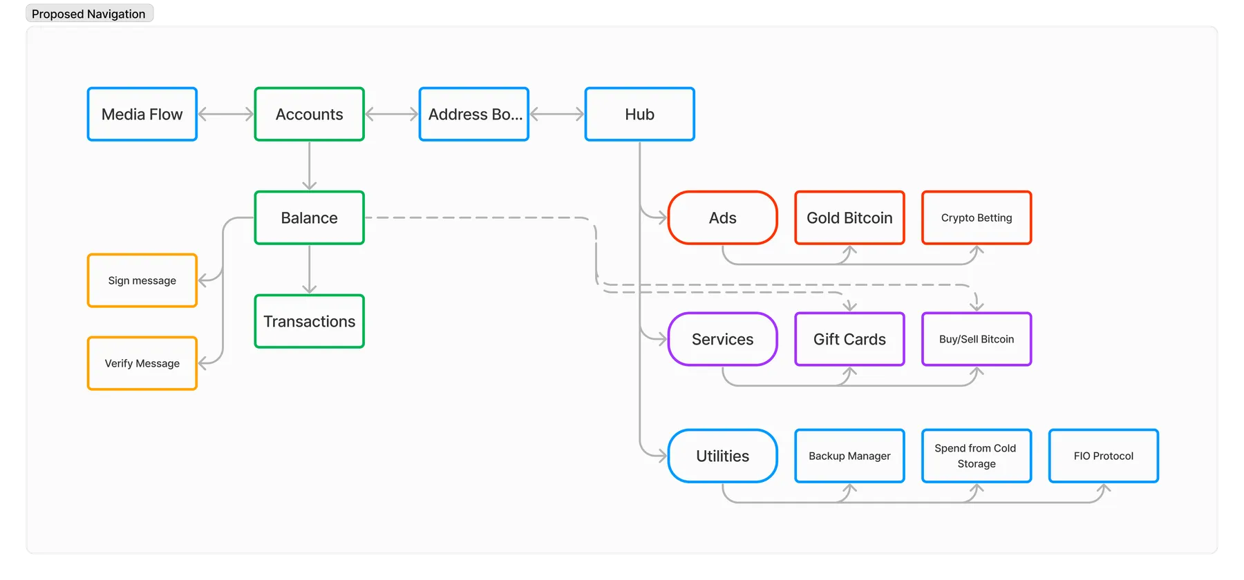
After analyzing all the problems of the current implementation of navigation, a simple 4-tab format can be applied in which there will be no navigation violations. The tabs are located at the bottom of the screen and are implemented by the Bottom Navigation component. If necessary, there is a slot for one more tab. All entry points to microservices and advertising are ecologically located in the Hub tab (or Services, replaces the current Businesses section), accessible from any screen. When touching a list item, it opens, and a long press, in turn, calls up a panel with contextual actions. If desired, Media Flow and Address Book can be moved to Hub to form a three-tab layout with an emphasis on a new future conversion tab, for example, an exchanger.
7. UX problems negatively affecting the Play Market rating.
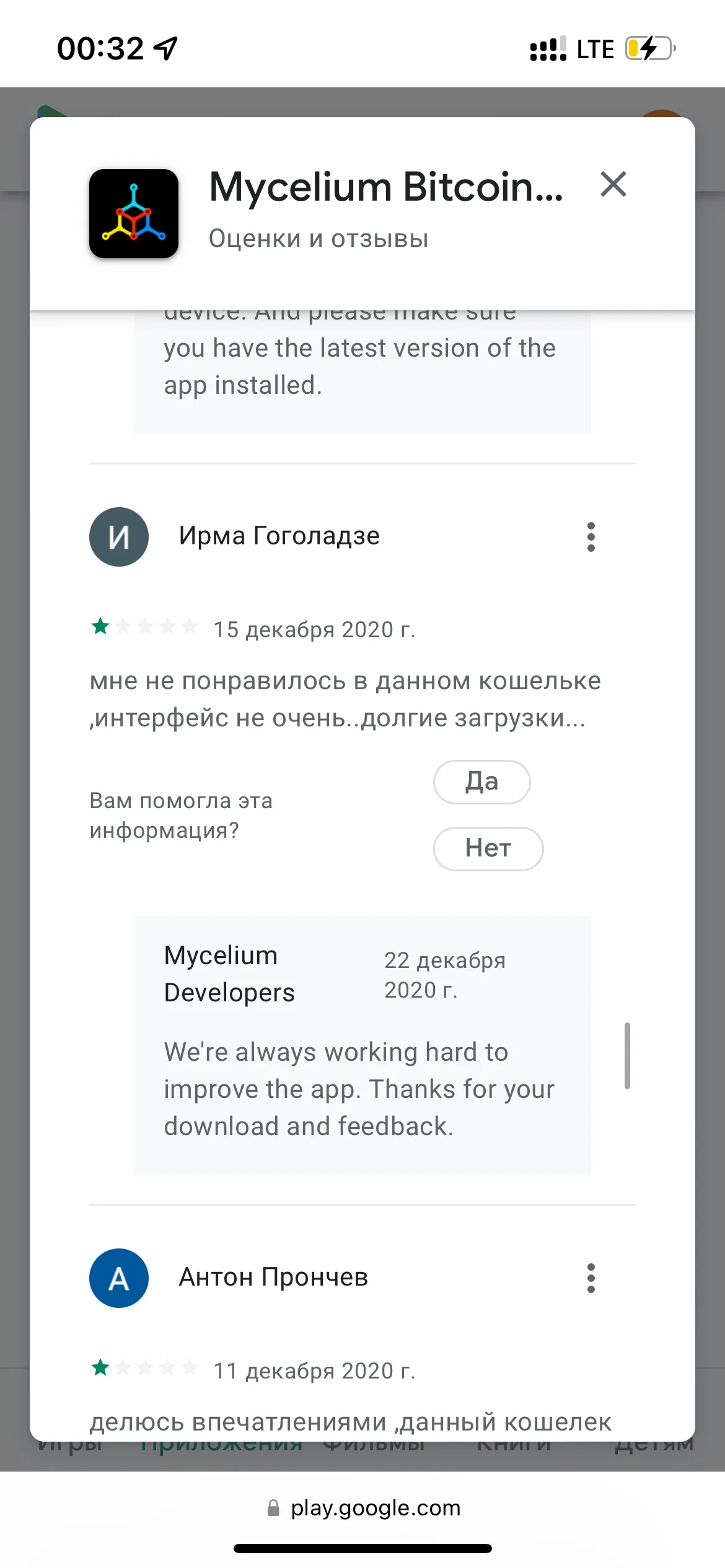
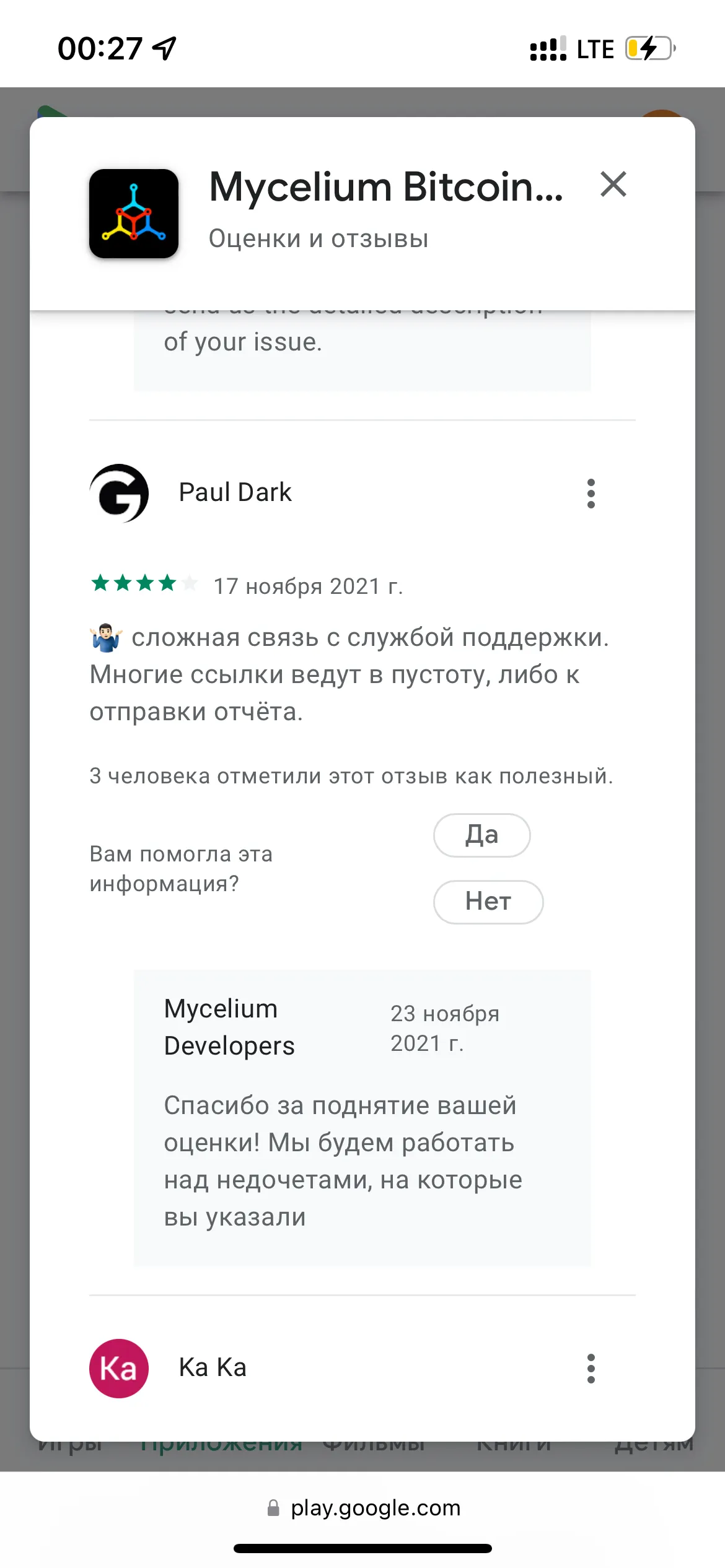
All reviews of the application in the Play Market were analyzed, of which 29 contained a factual designation of the problems that the user encountered. Let's start with the most popular situation when the transaction simply "gets stuck".
The user sent a transaction and it doesn't arrive.
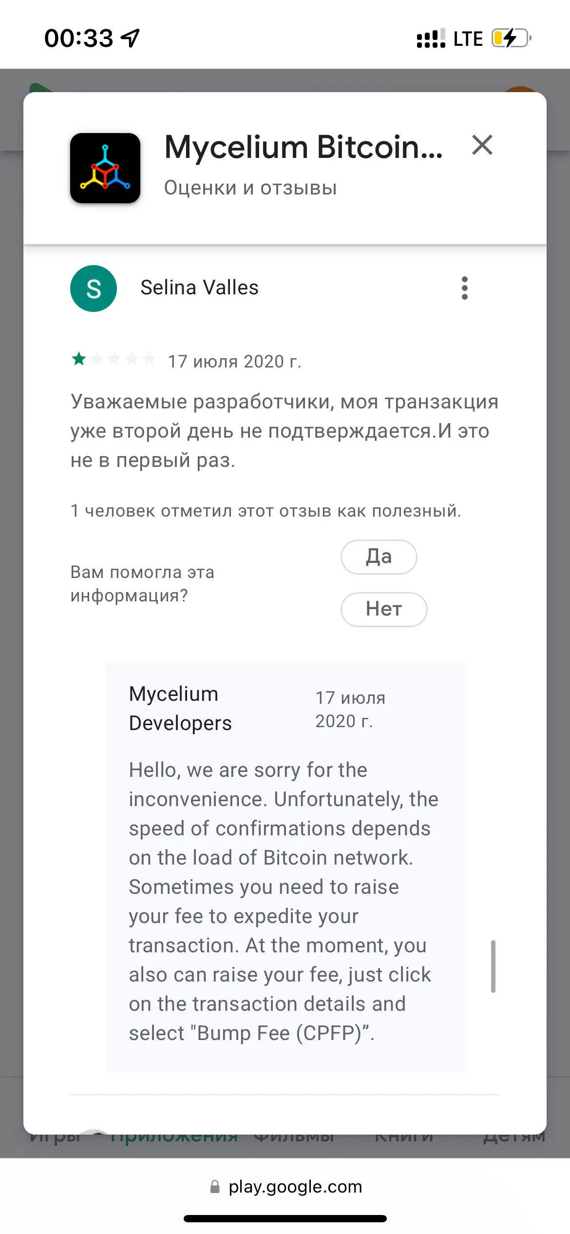
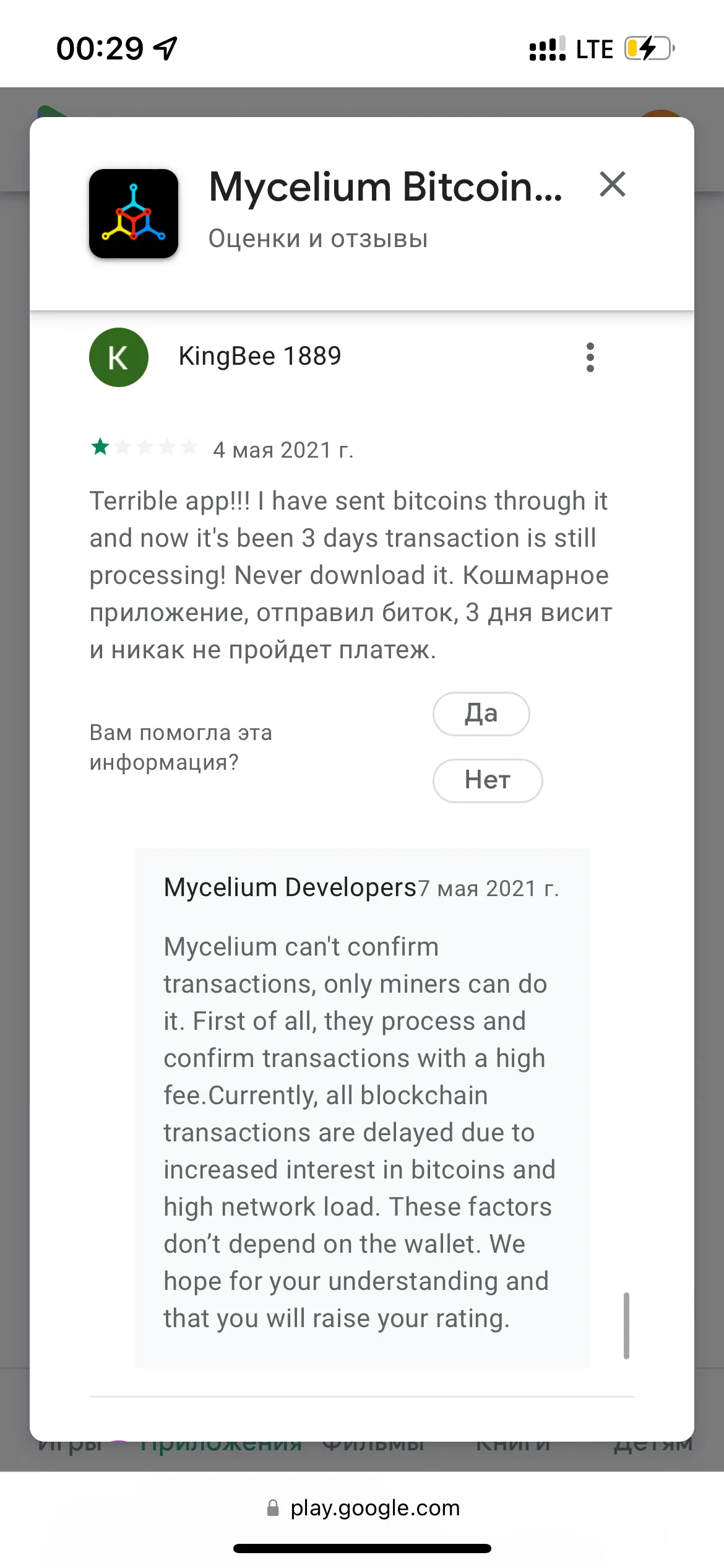
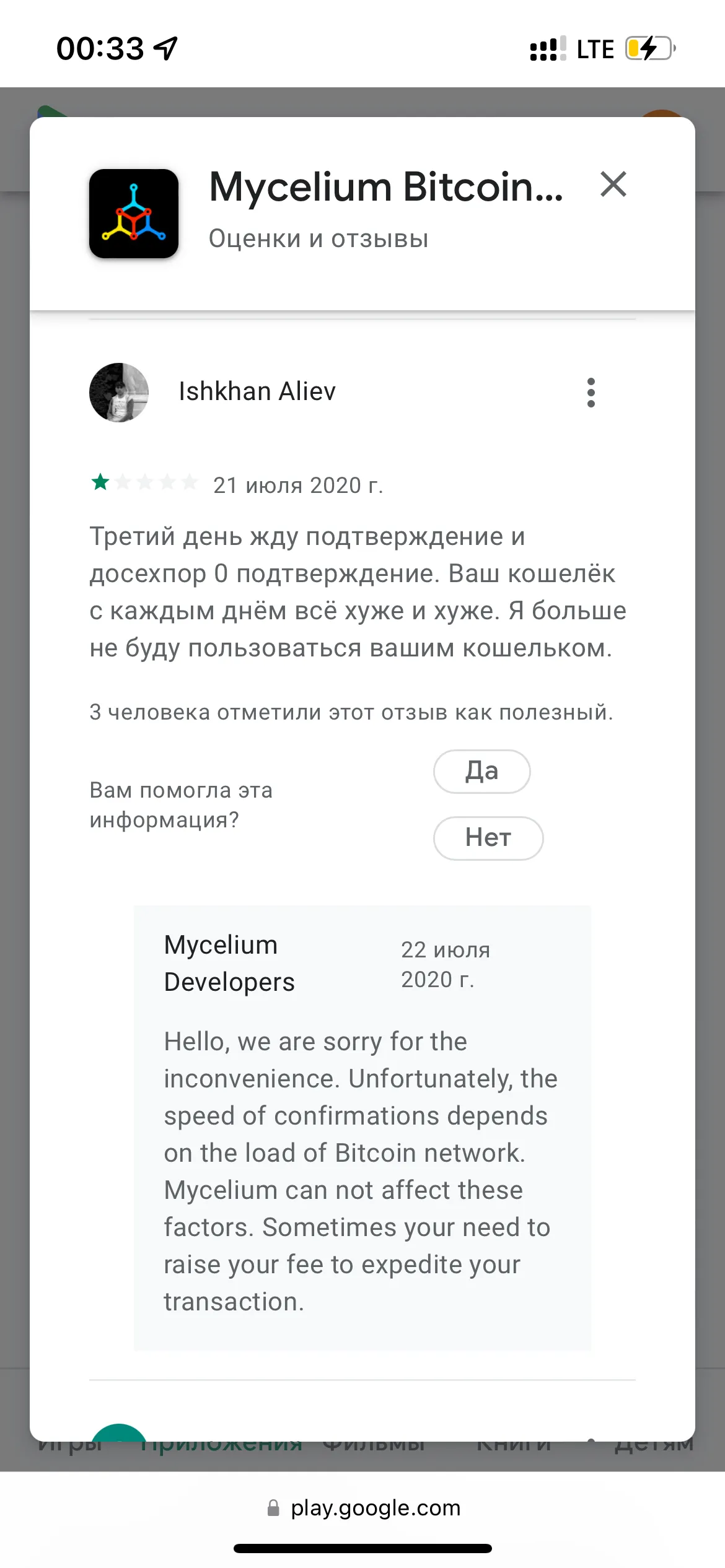
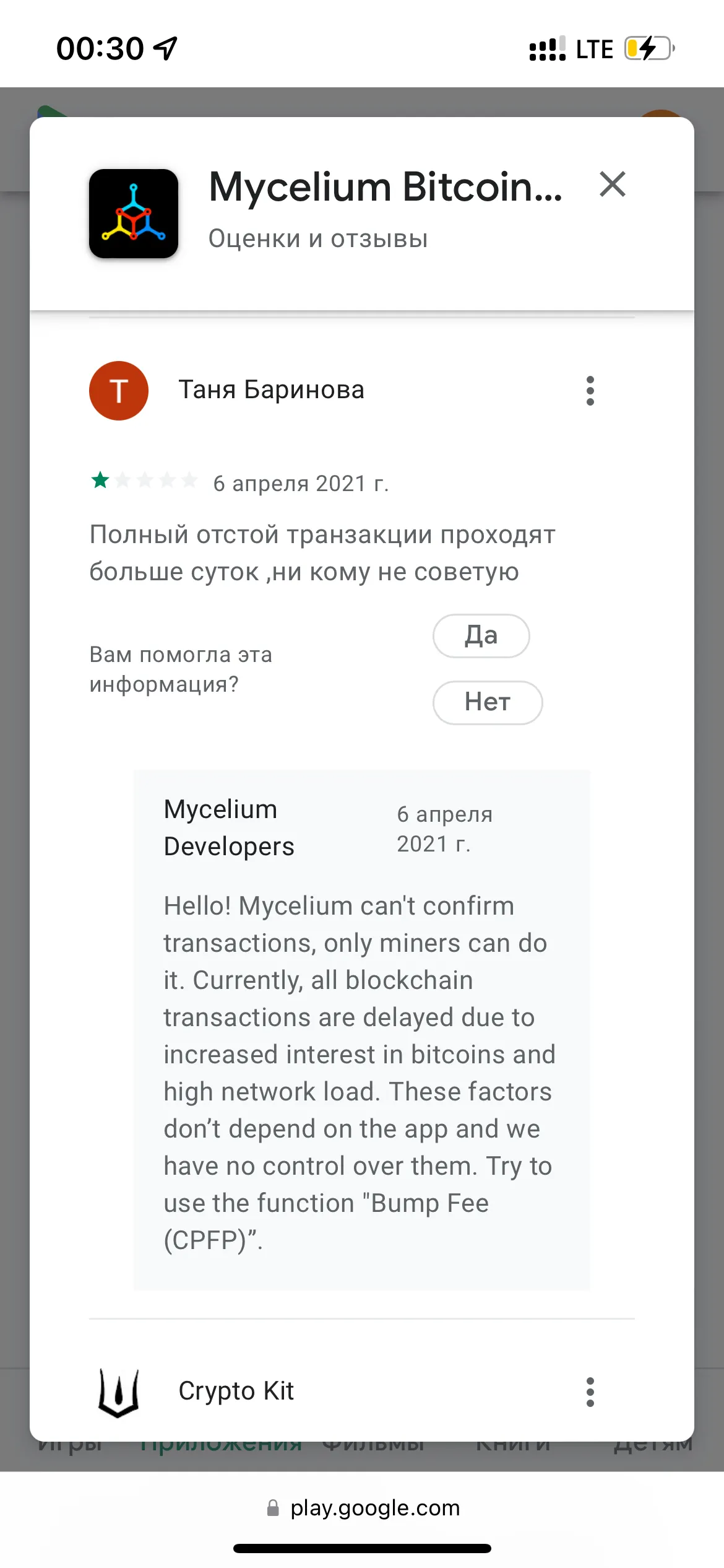
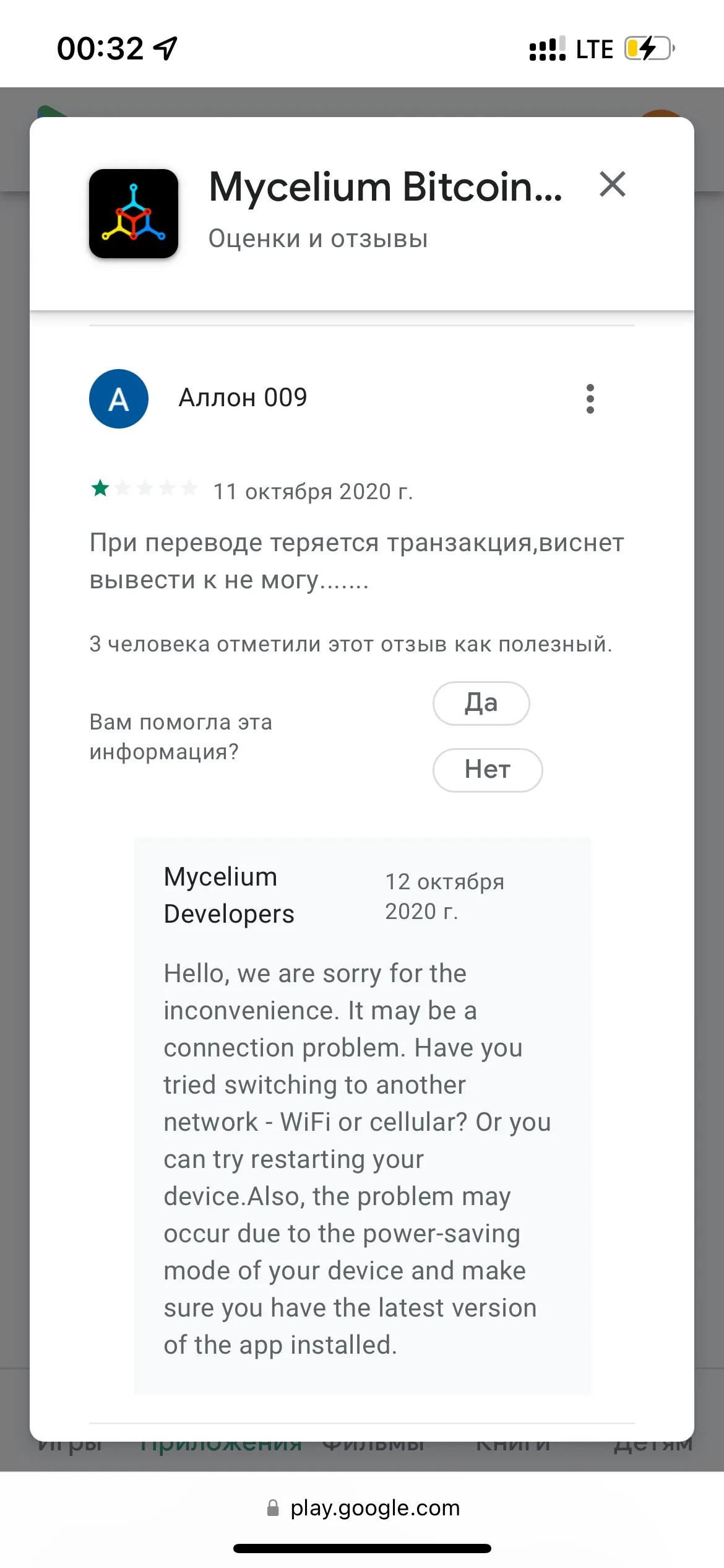
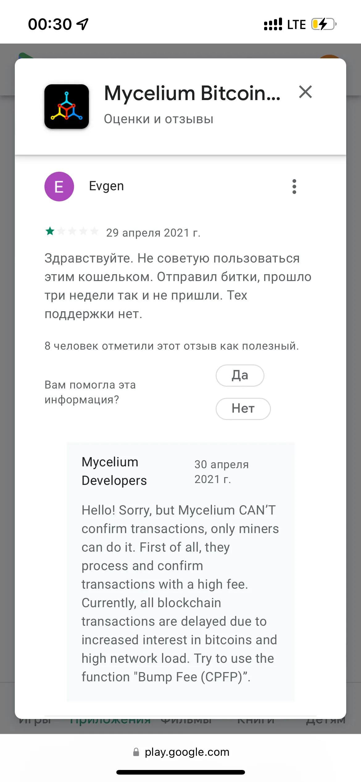
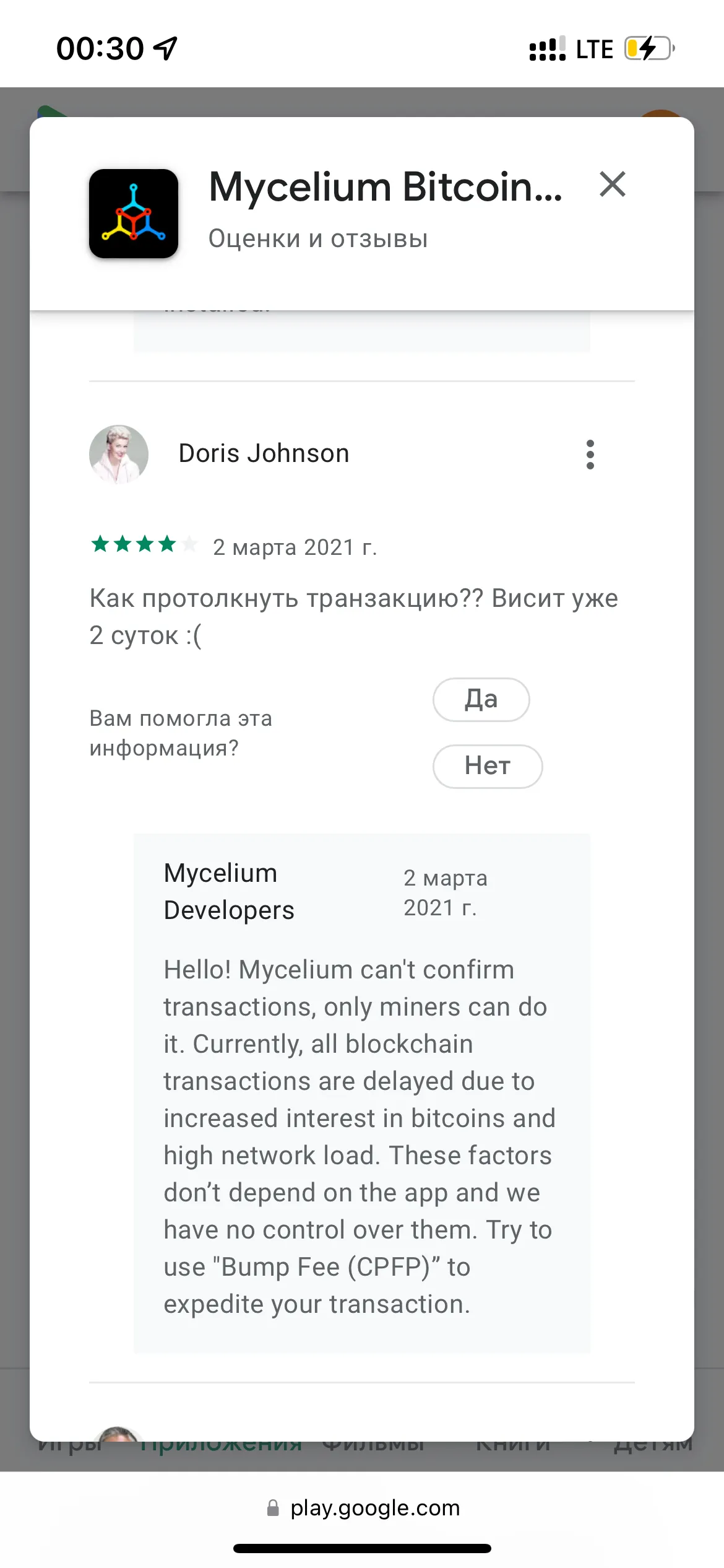
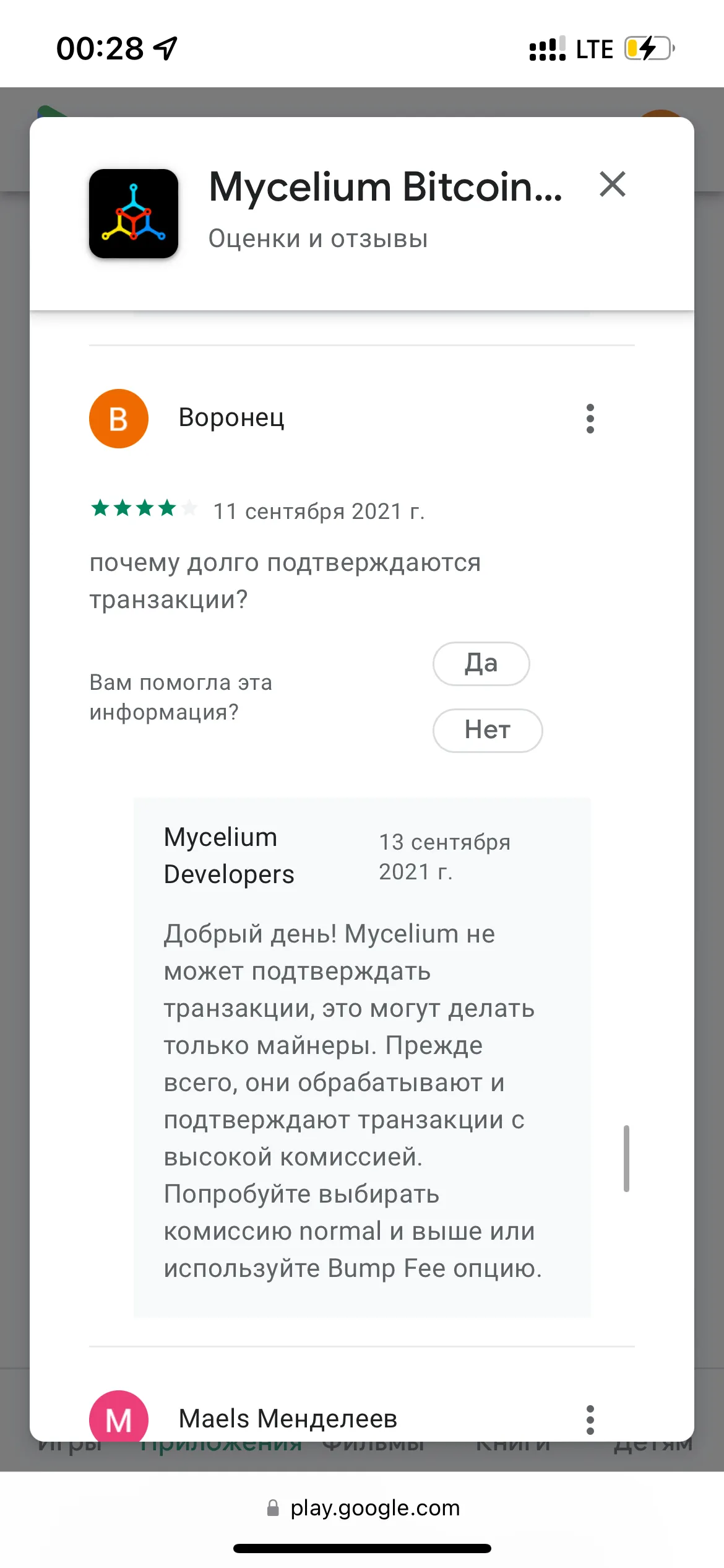
Root Problems:
- The transaction time calculation is not working properly on the coin sending screen
- If the user chooses too low a gas, there is no warning on the screen that the transfer may take a very long time.
- The app doesn't allow you to increase the fee for a stuck transfer.
Recommendations:
- Review the mechanism for calculating the approximate transaction execution time
- If the user chooses too low a gas, show a warning.
- Add the ability to increase the fee on the transaction screen.
HD account address has changed and the user thinks the money is gone.
Root Problems:
- The user is not sufficiently informed about how the HD account works.
- It's hard to find the entry point to the screen where the addresses used by the wallet are shown.
- Users do not understand which wallet is currently open on the Balance screen.
Recommendations:
- Explain how the HD account works in the onboarding and in the help on the account balance screen in HD mode.
- Place a button-link to the function of showing addresses where the HD account funds are located on the Balance screen.
Navigation difficulties
Root Problems:
- Too many tabs at the top level of the hierarchy.
- Entities of different hierarchy levels are placed in tabs
- The interface does not explain how the HD account works.
- Buttons that look like they launch a microservice, lead to a third-party site
Recommendations:
- Reduce the number of tabs in accordance with the recommendations from section 6.
- Leave Accounts at the first level of the hierarchy, and place Balance and Transactions at the second level.
- Explain how the HD account works in the onboarding and in the help on the account balance screen in HD mode.
- Do not use buttons as entry points to a third-party site, use banners.
Design assessment
We will give a quantitative assessment of the current state of the interface according to 10 Usability Heuristics by Jakob Nielsen;
Visibility of System Status: 6/10.
Positive Factors:
- It is visible when the wallet loses connection, or backups are not made.
- On key screens, it is visible that the wallet is sending a transaction.
Negative Factors:
- On the Balance screen, it is not very clear that the wallet is in HD mode and how this affects its behavior.
- In many menus, there is a lot of unnecessary information - entry points to irrelevant micro-applications and third-party sites.
Match Between System and the Real World: 4/10
Positive Factors:
- The application contains a noticeable share of understandable standard terms.
- The application uses the word Account for the wallet entity, thus drawing an analogy with banks.
Negative Factors:
- The definition of “HD” instead of “stealth” or “ninja”
- “Account uses 3 private keys” instead of “Account has 3 addresses”
- “Show unspent outputs” instead of “Show all used addresses”
- “Businesses” instead of “Services”
- The “Buy Crypto” button leads to registration on a third-party exchange, not to the function of buying cryptocurrency.
User Control and Freedom: 7/10
Positive Factors:
- In scenarios, you can go back without losing filled information
Negative Factors:
- It is not possible to cancel the change or deletion of any entity.
- It is not possible to cancel an unconfirmed transaction.
Consistency and Standards: 2/10
Positive factors:
- The design within the FIO Protocol section of the application is quite well implemented.
Negative factors:
- The interface contains more than 5 independent styles within the application.
- The hierarchy in the first-level navigation is violated.
- The behavior logic scenarios when selecting list items are violated.
- The main navigation contains too many tabs.
- The Banner component does not comply with the guidelines.
Error Prevention: 7/10
Positive factors:
- The application does not allow the seed phrase to be unloaded without a set PIN code.
- The application does not allow the seed phrase to be unloaded for 2 days after changing the PIN code.
- The application warns that the seed phrase has already been unloaded.
- The application forces you to write down the seed phrase on paper and does not allow you to simply copy it completely.
Negative factors:
- The application does not warn that too low gas is set for the transaction and it can hang.
- The application does not warn when changing the PIN code that the seed phrase unloading will be unavailable.
- When sending from an HD account, the application does not warn that funds will be spent immediately from several wallets, and all of them will be highlighted in one transaction.
Recognition Rather Than Recall: 7/10
Positive factors:
- The transaction sending screen contains all the information about the transaction.
Negative factors:
- The user must remember that the button for viewing addresses where the balance is stored is hidden in the Accounts section.
- The user cannot see that he is using an HD account on the Balance screen.
Flexibility and Efficiency of Use: 4/10
Positive factors:
- You can access the FIO Requests and Gift Cards sections in several ways
Negative factors:
- The wallet is inconvenient for beginners who do not know the features of the application
- There is no full-fledged tour teaching beginners the features
- It is impossible to send a transfer from the Address Book.
Aesthetic and Minimalist Design: 1/10
Positive factors:
- The FIO Requests section looks quite good
Negative factors:
- Navigation is disorganized, has hierarchy violations
- Fields are not observed on many screens
- Backgrounds are superfluous elements
- Unsuccessful restyling of pop-up windows
- Lists are very poorly designed
- Eyeballing accent colors
- Unattractive look of the Banner component
Help Users Recognize, Diagnose, and Recover from Errors: 8/10
Positive factors:
- Motivates the user to create a backup and check it.
- Error texts are clear.
Negative factors:
- There is no possibility to increase the gas in a slow transaction and there is no warning before sending.
Help and Documentation: 2/10
Positive factors:
- For some very rare things, like digital assets, there is contextual help
Negative factors:
- The main feature of the application - HD accounts is not explained, which causes a lot of problems for users.
- It is not explained what the difference is between different formats of bitcoin addresses
- There is no help on how gas is calculated
- It is not explained what the FIO Protocol is
- There is no information on how to read information from the transaction page
Conclusion
The application design contains a large number of critical problems in the UX area, making it difficult for the average user to use. It is strongly recommended to apply the recommendations given in this report before proceeding with the addition of any new functionality.