Introduction
My mission in 3commas was making the design team as a unit following the core values – priorities of the design team:
- Rationality
- Consistency
- Aesthetics
- Movement in small steps
- Affordability of hypothesis testing
- Reducing the path from task to result in production
- Predictability of the result
All work with the design system was done with the focus on 3 of them: Consistency, Aesthetics and Reducing the path from task to result in production. Design system (if we could call it so) in its initial state suffered from several problems.
Stakeholders
- CEO
Wants to save money during design and development of future features and products. - CPO
Wants to speed up design and implementation process. - Dev Lead
Wants to have process split in stages, so devs could switch architecture and then design, wants seamless synchronization of components. - Designers
Wants to have all the used components in Figma with usage examples, DO’s and DON’T’s.
Initial state of the design system
Lack of synchronization
Some components persisted only in Figma, some only in Storybook. That increased time to design, because designers had to re-create some components on the go within a file they were working on or spend time searching multiple files to find the needed component.
No documentation
It was hard to understand for designers or developers how a particular component should act just looking into the Figma file, without trying to find another examples of this component. This resulted that sometimes designers received feedback from developers that component, inserted in the design, in code acts completely different and it would be a bad idea to alter it there following the design.
Unexpected variations
During the history of the 3Commas, there were several changes in visual style. Some initial components were modified with custom shades of colors, while all the base components were updated later. These lived locally and were out of sync in color or character.
Design inconsistency
Take a look at all these examples. Can you guess it’s a same product or not?
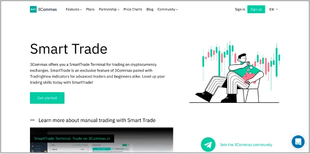
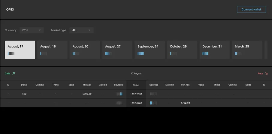
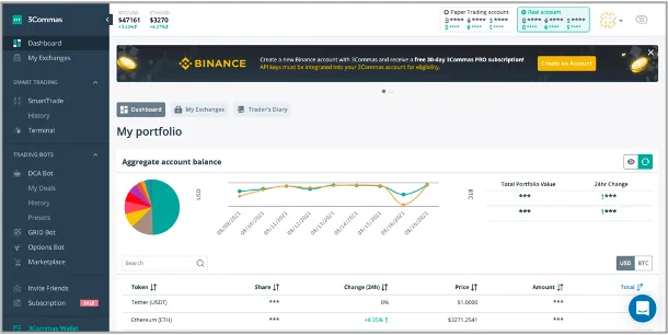

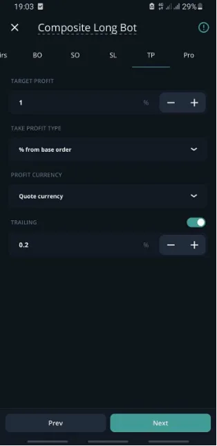
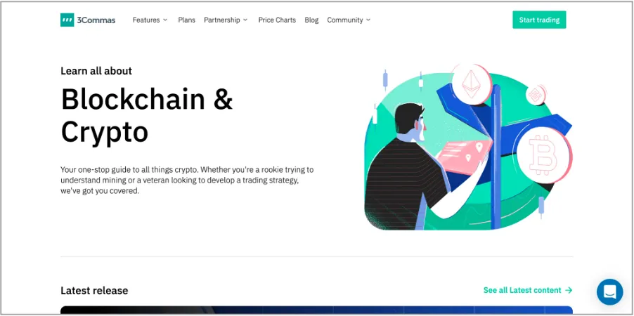
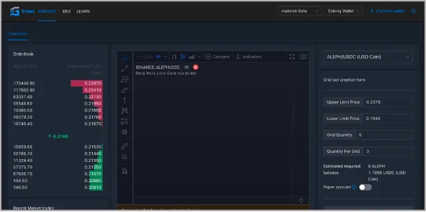
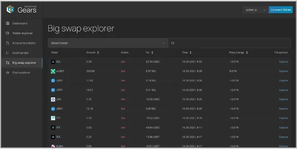
Several design systems (to be precise, UI Kits) should be maintained at the same time. This involved significant expenses for the company, because each of the components are implemented differently. Developers can’t use the same codebase in each project, can’t just copy, paste and refine interfaces and designers couldn’t easily switch between tasks within the scope of all company products because logic and structuring were different.
Just evaluate it by yourselves. All these products had different visual style and UI codebase:
- External site
- 3commas Academy
- WEB platform
- iOS application
- Android application
- 3commas wallet
- Gears
- Opex
- Gridex
- 3commas Enterprise
Usability issues
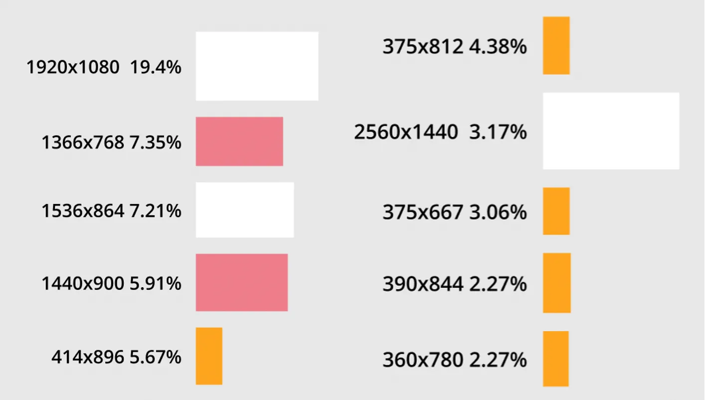
13 percent of Desktop users can’t feel a full-fledged 3Commas experience because interface didn’t fill their screen properly. Trading terminal, Smart Trades and Grid bots required scrolling even on 15’ Macbook Pro.
Step 1. Synchronization of the old design system
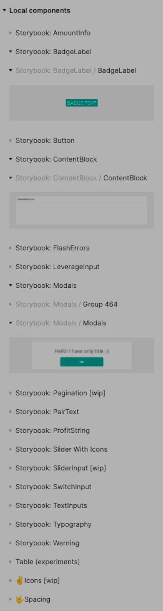
The first step that we took was to find all the common elements of 3Commas along the website, Storybook and design files and recreate them in our Figma library using newly (at that moment) appeared “Variants” feature. This was a very labour intensive task. It took one month for me and junior designer Olga to accomplish. There were 300+ buttons (including states), 50+ text inputs and 17 pages of elements in total.
By accomplishing this altogether with optimization of management processes I optimized the design process to reduce feature design cycle 2.4 times in average.
Step 2. Analyzing and refining the old design system
The next stage was to evaluate which components could be improved. Some suffered from bad accessibility because of lack of contrast, some missed signs of interactivity (users on tests didn’t noticed that element is interactive because there were no hover animation, popups were ugly and inconsistent with interface, lacked close button and visual hierarchy. We put standardised notes on all the sheets with elements with pros and cons of current state and implemented some necessary changes to sort out current tasks.
Step 3. The New Design System
Finally, after all we finished with refining the initial design system, it was a time to implement the new one. At this stage we know everything about problems and points of growth of the old one and can use this knowledge to lay them in fundamentals of a new one.
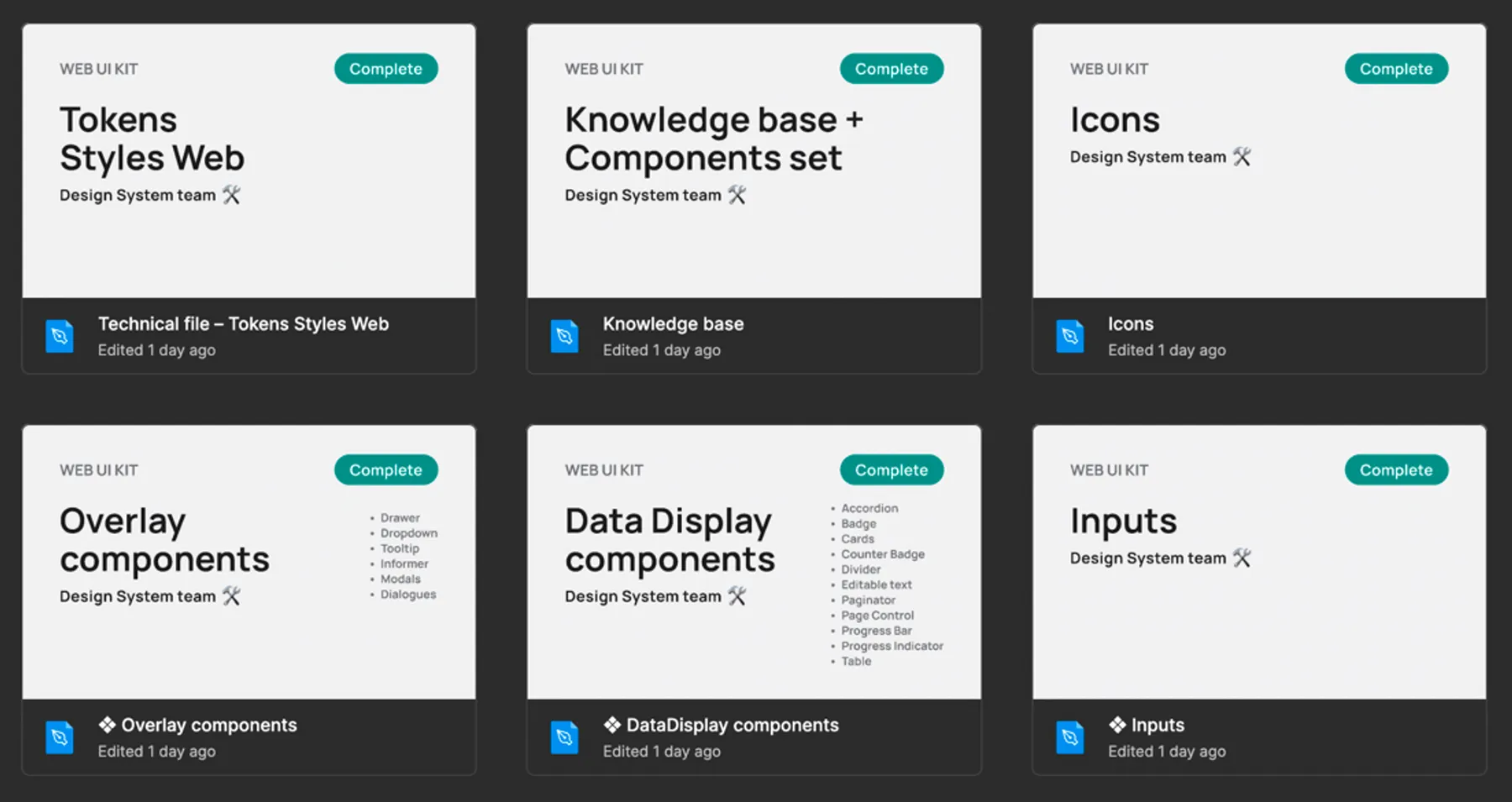
To define the visual style of design system, I conducted weekly meetings with all the designers team. We found and discussed good solutions on the market, pinned those that we like.
Also I asked the team to create their own variants of key components - tables, cards and navigation. We discussed it all together to understand what would be better to use universally, because designers of every different parts of the product had his own vision.
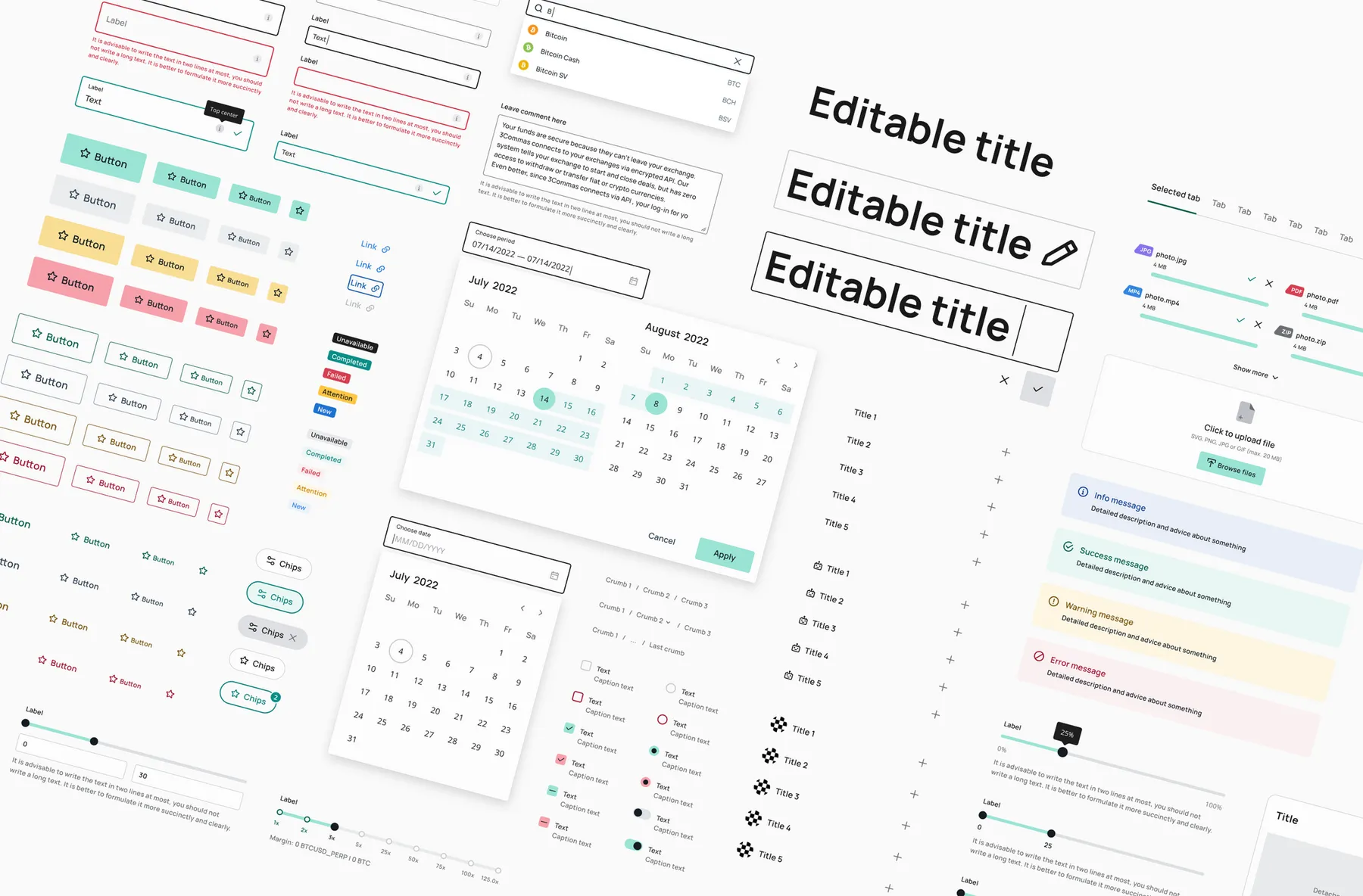
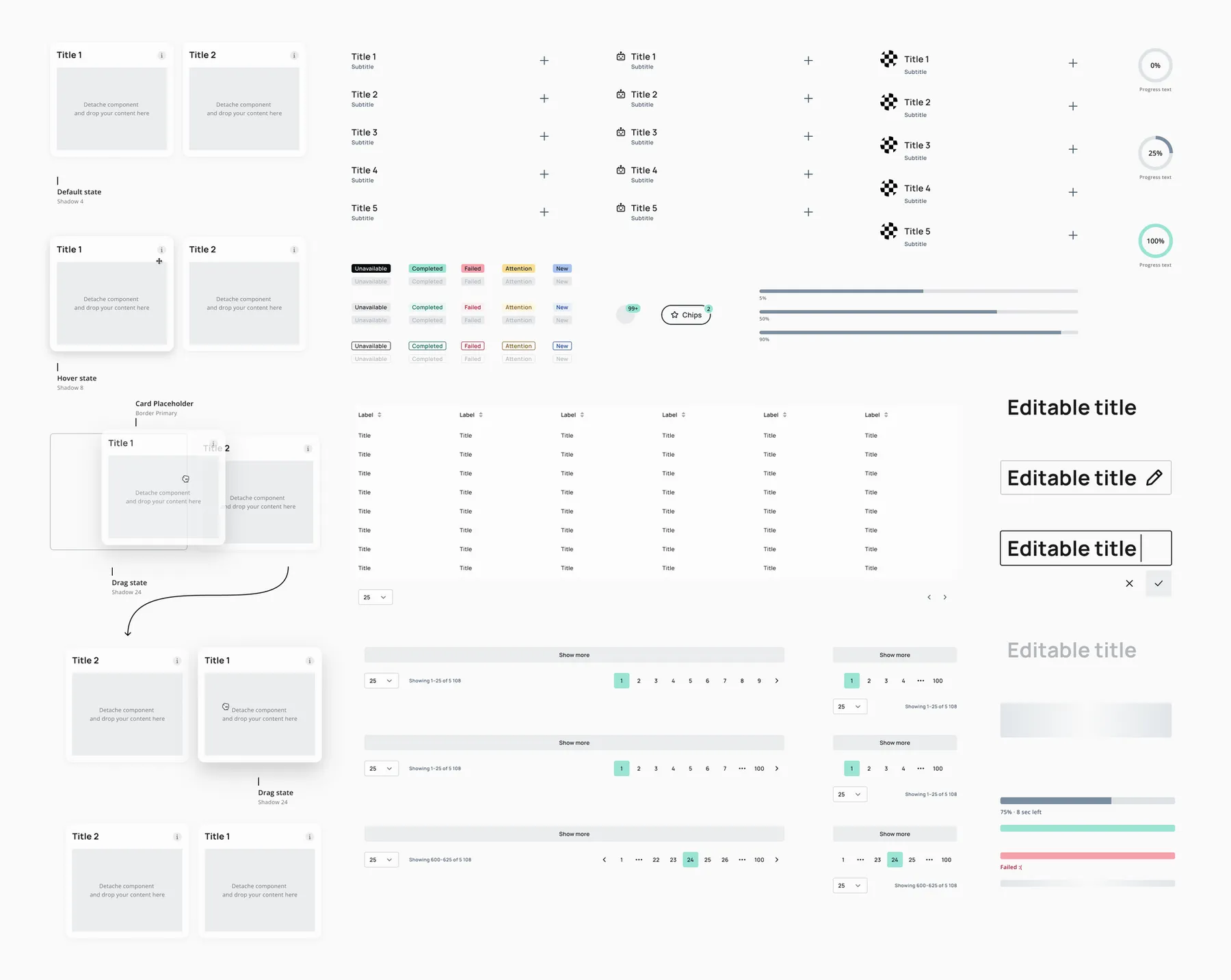
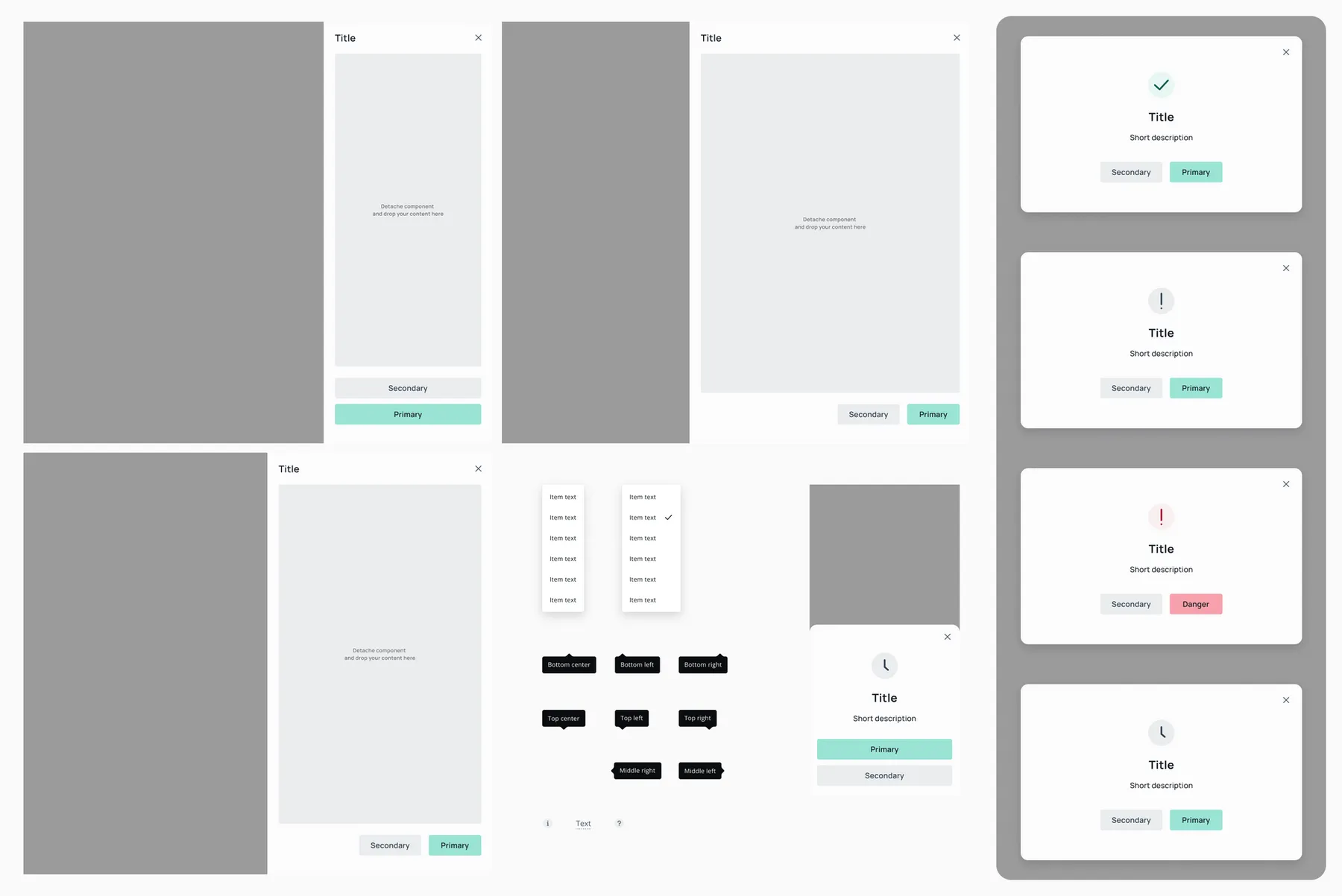
Later a base component sets with unified structure was created in Storybook and Figma:
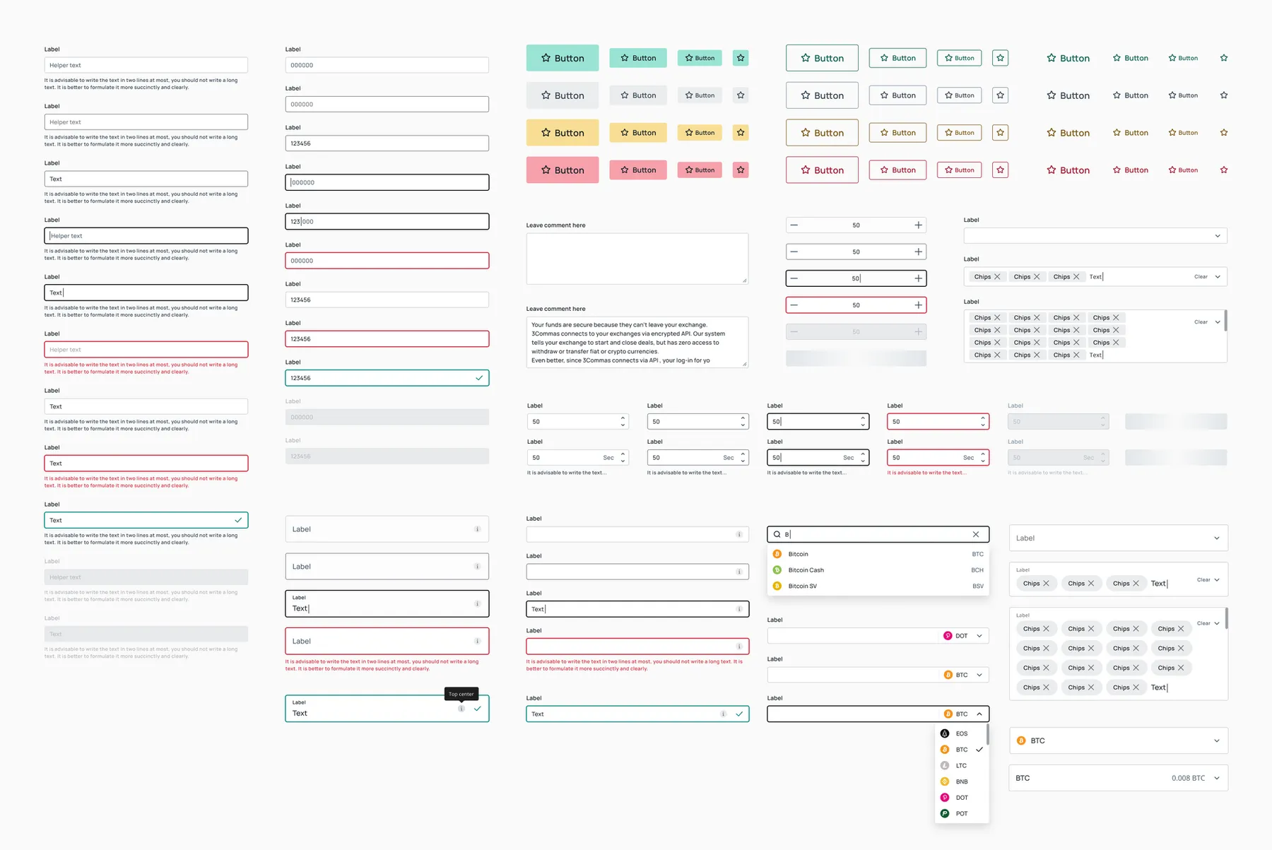
Forms
- Base input
- Select input
- Number input
- Stepper input
- Textarea
- Input suggest
- Buttons
- Checkbox
- Radio
- Switch
- Chips
- DatePicker
- File Uploader
- Notifications
- Scrollbar
- Slider
Data display components
- Accordion
- Badge
- Cards
- Counter Badge
- Divider
- Editable text
- Paginator
- Page Control
- Progress Bar
- Progress Indicator
- Table
Overlay components
- Drawer
- Dropdown
- Tooltip
- Informer
- Modals
- Dialogues
Navigation components
- Breadcrumbs
- Link
- Tabs
Icons
24x24 px Line and Solid scalable icons
Components and their structure
The component consists of ATOMS, PARTICLES (Content View) and PRESETS (Variants).
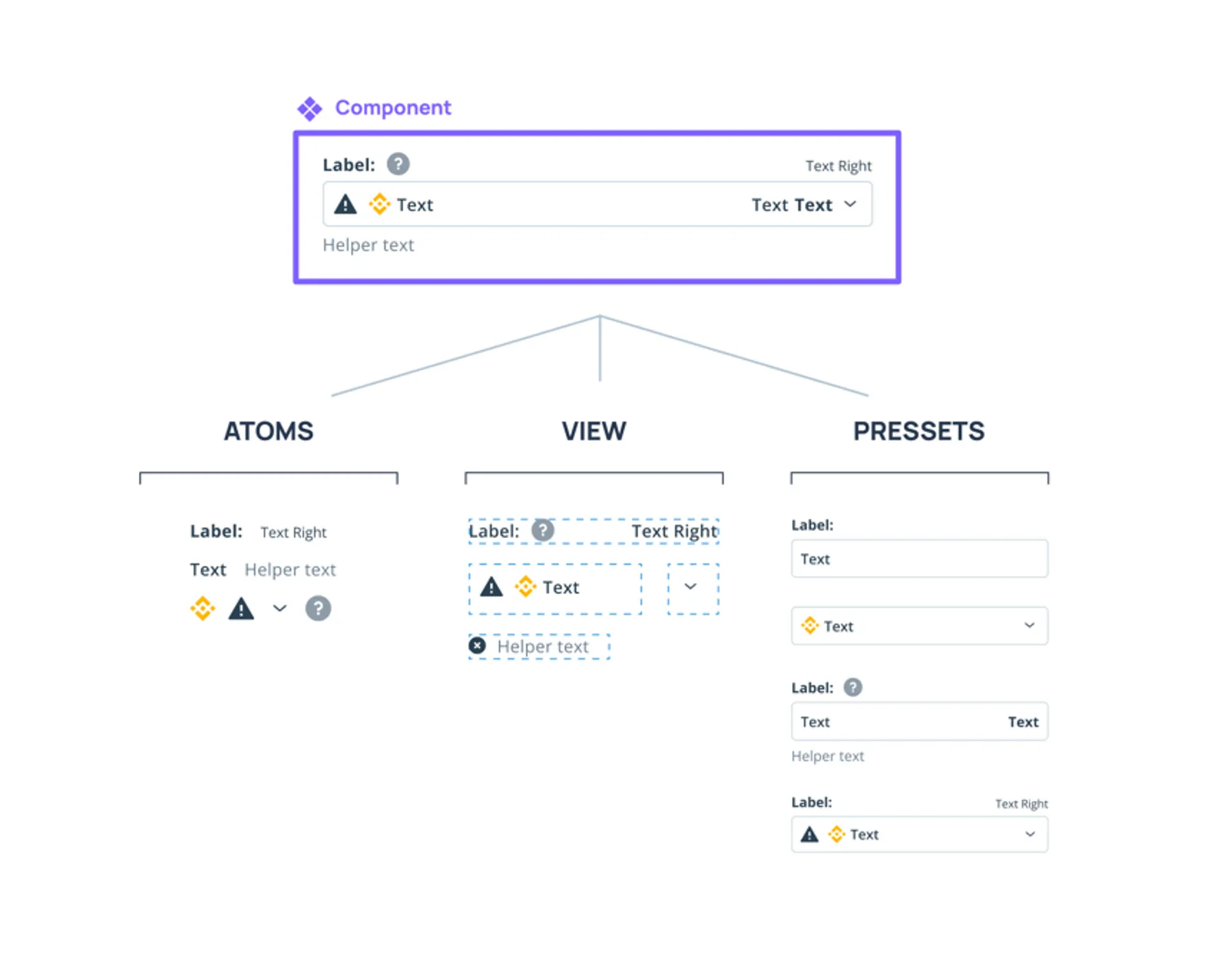
Types of components in the system
UI-kit component
The basic unit of the design system, for multiple use in the platform interface.
Generic component
The components are not from the Storybook, but due to the frequent reuse in other scenarios, they may become platform-based.
Feature component
They are not from the Storybook, are either temporary or difficult to maintain and scale, and are unique to the scenario. Developing a component is possible if the team is willing to take the risk and support it, and the solution fits with the rest of the design.
Structure
We wanted to build the same component structure in Figma and Code side. Before component creation we had a brainstorm with the Design System developers about main settings of any component (variants structure). We discussed ways to make components more flexible and easy to use by designers and developers. After the discussion we found one flexible way for any kind of component.
We called it Prefix, Content and Suffix.
The main idea is based on atomic design process. Every component have the main content part (like Text) and could be upgraded with some objects on the right or left part (like icons, image, switchers, checkboxes etc).
Let’s look how it works on the Button. As you can see the Button have Content (Text) and options to show Suffix or Prefix, which has a link to nested instances. In this case nested instances are icons. It is really easy to use and any changes can be applied by just using Figma’s variants panel.
Also we talked about React settings. As you can see in Figma, component variants like “Disabled”, “Loading”, “Shimmer” has a switch to turn it On and Off, similar to React component settings.
Here is a more advanced component: the Base Input. Take a look on how we use concept of Prefix and Suffix here. As you can see, we can add any functionality in the right part, like reset button, informer, additional text — anything. It’s flexible and easy to implement any design decision in code.
Unfortunately, the whole UI-kit in this case can’t be shared (because of NDA politics), but in this example file with Button you can see the main logic of components building and how documentation for designers and developers was being prepared on the side of Figma.
❖ Buttonswww.figma.comStyle token structure
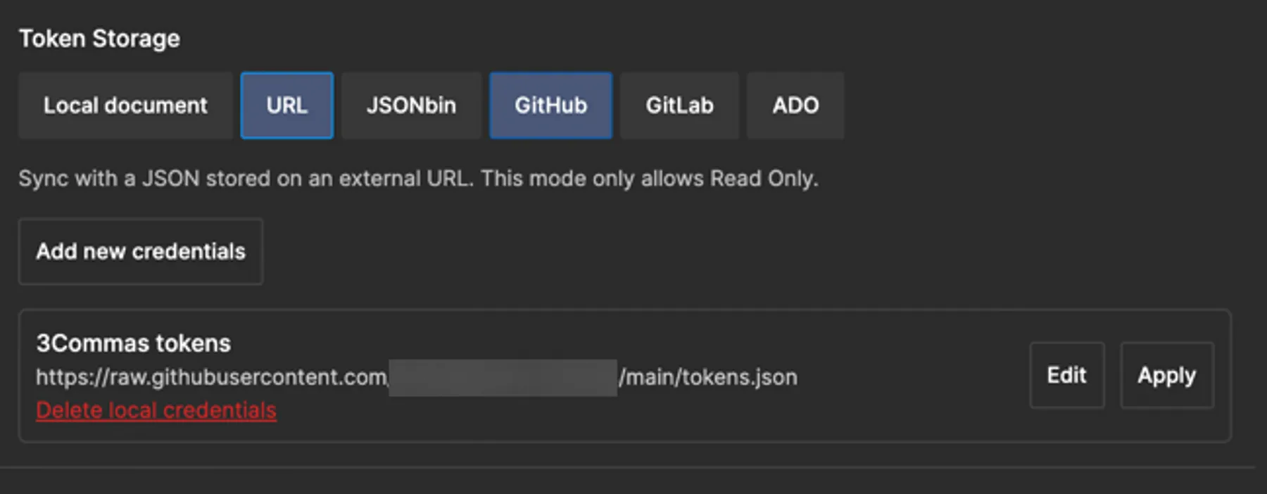
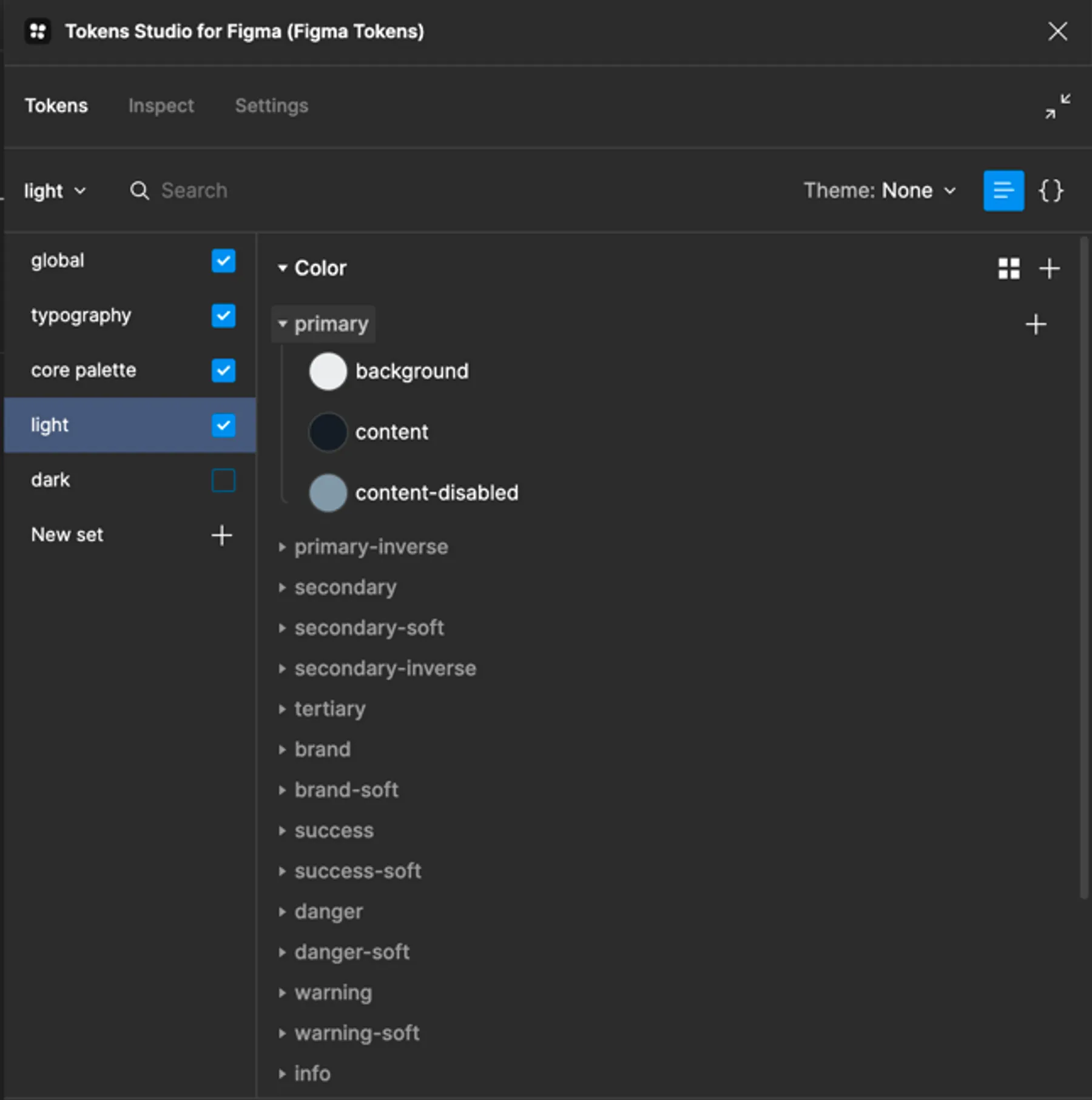
Tokenization was used both in the design and in the code of the design system. We used Token Studio plugin for Figma for this. In the plugin all the global settings and color themes were set up. Afterwards we linked it with our GitHub, pushed the JSON file, and shared a link to developers and designers. From this moment all the team members had only one source of truth in styles. It is really helpful, when everyone speaks the same language.
Color tokens structure
We used 3 level of color token structure:
- CORE pallet (HSLA color tokens)
- ALIAS pallet (Semantic color tokens) — this level is used in Figma
- COMPONENT pallet (Component color tokens + Component States)
This levels have a crosslink structure in json file. But in current iteration only CORE and ALIAS connection are made in JSON file for designers. But on developers side they can use only ALIAS link when they build components and create COMPONENT pallet from the code side.
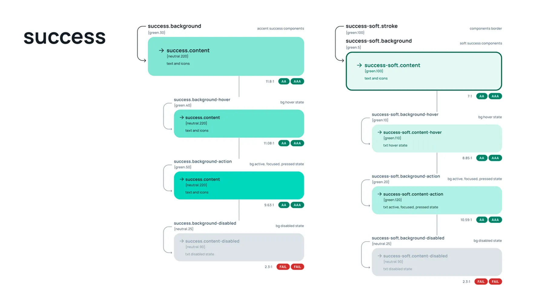
In the following Figma file you can see the main logic of color tokens:
Color tokenswww.figma.comResearch
Before building json file, other alias structures were created in Miro and discussed with the design team, which way they could work for us.
We decided that the more safe way for the future work would be if we create Aliases with this group structure:
Color group
- Primary
- Secondary
- Brand
- Warning etc.
Usage
- Fill (Background)
- Content (Text)
- Stroke (Border) — optional group
Interaction
- Default
- Hover
- Actions (Active, Focused, Pressed states)
- Disabled
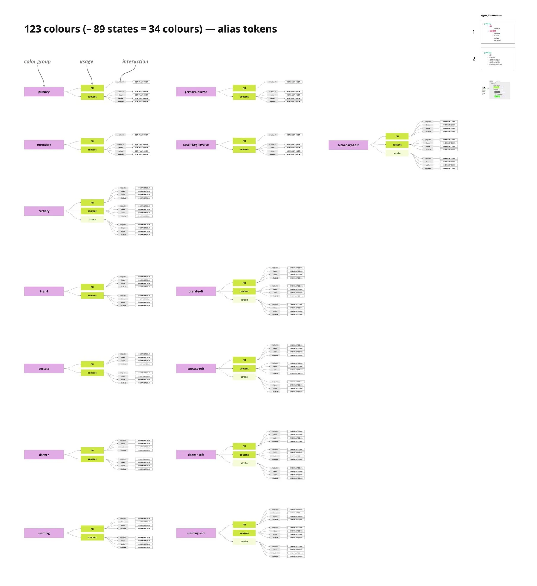
This structure would help to use mixins on the code side, when developers will build components.
For example,
const BadgeContainer = styled(Box)`
   background-color: fill("primary");
   color: content("secondary").hover;
Global tokens structure
Basically a few branches in JSON were created:
Global
- Sizing
- Spacing
- Border radius
Typography
- Font Family
- Font Weight
- Line Height
- Font Size
- Letter Spacing
- Paragraph Spacing
- Text Case
Core pallet
HSLA colour groups with a grade of lightness
Light theme
Semantic color structure from Core pallet for the light theme
Dark theme
Semantic color structure from Core pallet for the dark theme
Sizing – global fixed size of any elements. This setting can be applied either selectively in height or width, or all at once.
